December 4, 2024
•
Data Visualization
We’re thrilled to take you behind the scenes of Webi dashboards and uncover the possibilities they offer to elevate your business intelligence (BI) experience.
Who will find value in this blog?
👤 SAP Business Objects users: Explore functionality and usability enhancements.
👤 Dashboard designers: Discover aesthetic techniques and technical implementation tips.
It’s not uncommon for SAP BO Webi users to ask us, “How did you create such a visually appealing dashboard? Is it genuinely Webi, or did you use customizations?” These frequent questions inspired us to reveal the untapped potential of Webi, especially with the exciting advancements introduced in SAP Business Objects (SAP BO) 4.3.
Before we dive deeper into SAP BO, we encourage you to check out our blog post, “What is the Recipe for a Perfect Dashboard?”, which outlines key principles applicable to all BI tools for successful dashboard creation.
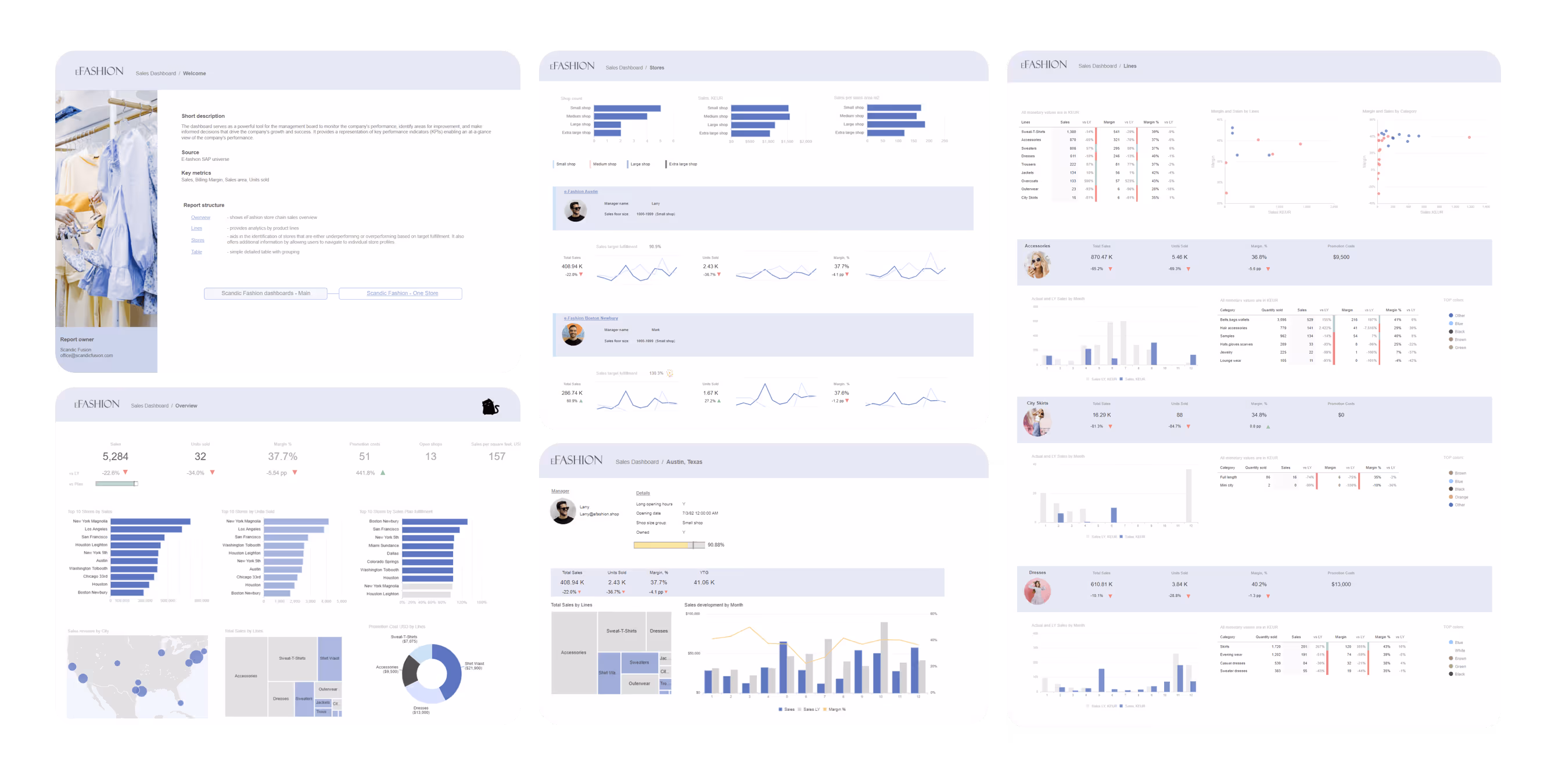
The foundation and heart of this blog post is a dashboard designed by our passionate team, based on the SAP default e-fashion universe.
This dashboard showcases:
Let's begin with a brief overview of what this dashboard offers from a user journey perspective and then delve into its technicalities.
From a business perspective, the dashboard serves as a powerful tool for the management board to monitor company performance, identify areas for improvement, and make informed decisions that drive the company's growth and success. It visually presents key performance indicators (KPIs), providing a quick overview of the company's performance.
The dashboard contains several pages:
By exploring these pages, users gain a holistic understanding of the company's performance metrics and can make data-driven decisions to steer the company toward success.
Here is a preview of all the pages:
And now is the time to uncover what’s inside! We’ll dive into the technical details and share practical dashboard design tips. First, we’ll explore the global objects and the welcome page, followed by a deep look into the functionality of all dashboard pages and how they can be effectively utilized.
To achieve global objects or settings across dashboards, we use the shared element functionality or implement global settings from the server side.
The most popular global shared element objects are headers, icon libraries, and technical tables about sources.
Global settings include the default style sheet and the defined corporate palette.
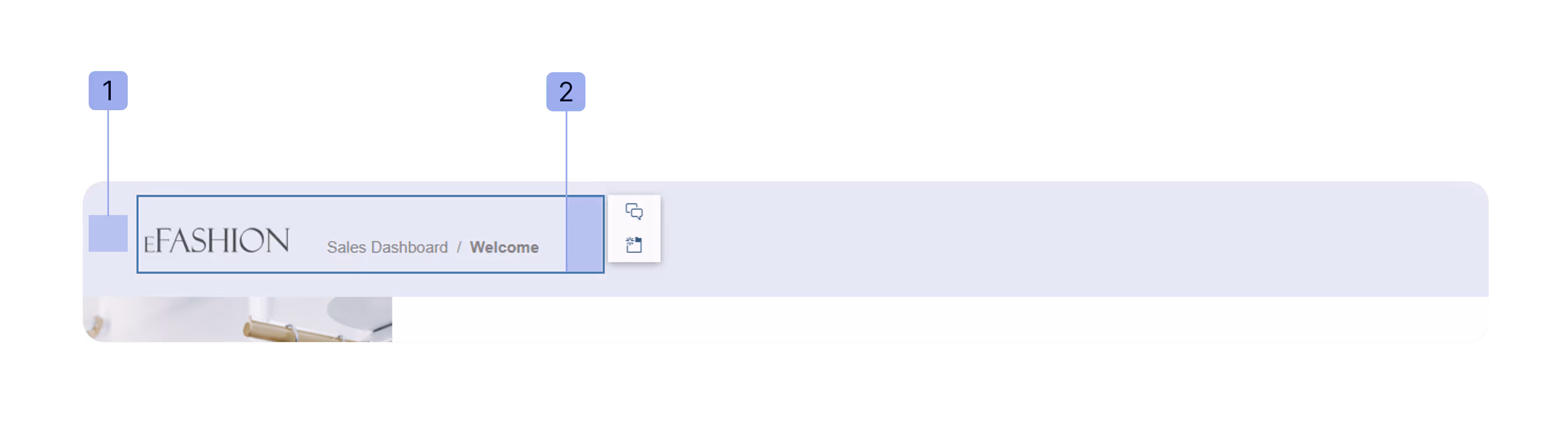
The header panel consists of several elements:
Here is the formula for the dynamic title, which inherits the document name and the report name:
= DocumentName()) + “ / ”+ ReportName()
💡Hint: Create a table and place the logo within a table cell (instead of using several objects). This makes it easier to save or copy the table to another page as a shared element.
⚠️ Note: If headers are placed in the "Header" panel, they won't be visible when exporting the dashboard to Excel.
The default style sheet on the server side allows you to apply predefined styling to a new document or update it globally (for documents where manual formatting has not been applied).This ensures consistency and saves time when working with exported reports.
For more details, check out the SAP official documentation on what can be customized using Cascading Style Sheets (CSS). Formatting your reports with CSS not only makes your reports visually cohesive but also ensures they align with your brand guidelines.
💡 Hint: Not everything can be defined within CSS. For elements that are harder to style via CSS, we suggest creating an empty document with placeholders and a structured layout. This makes it easier to copy formatting later and ensures your exported Excel files maintain their intended structure and design.
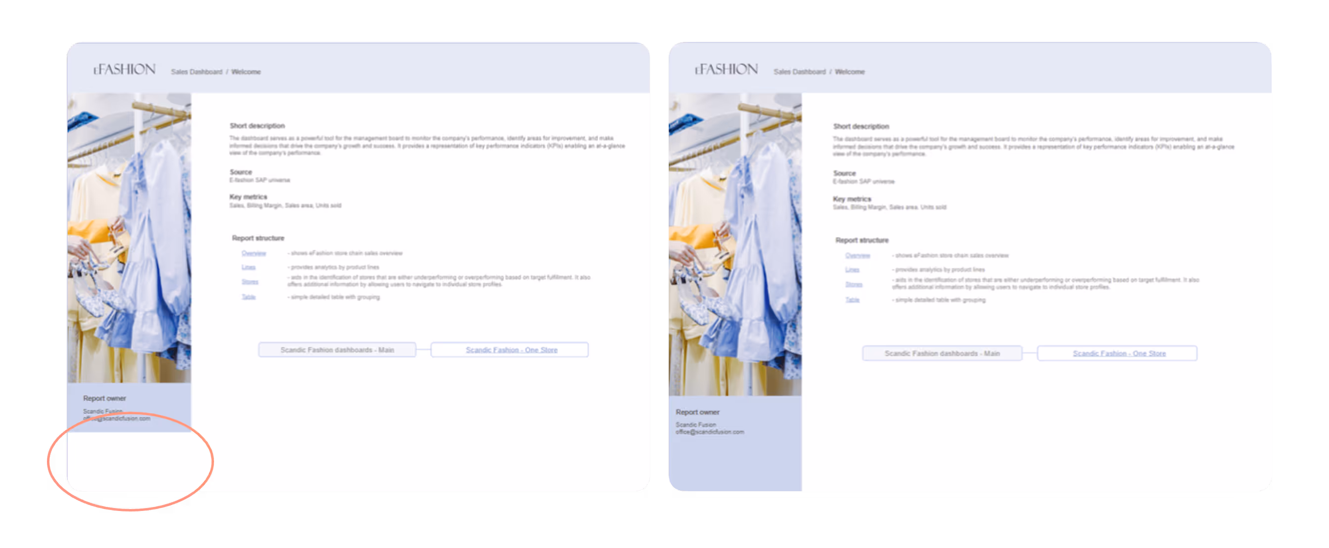
Our typical welcome page includes the following elements:
And as a delightful bonus, we include an eye-catching image to enhance the page’s appeal.
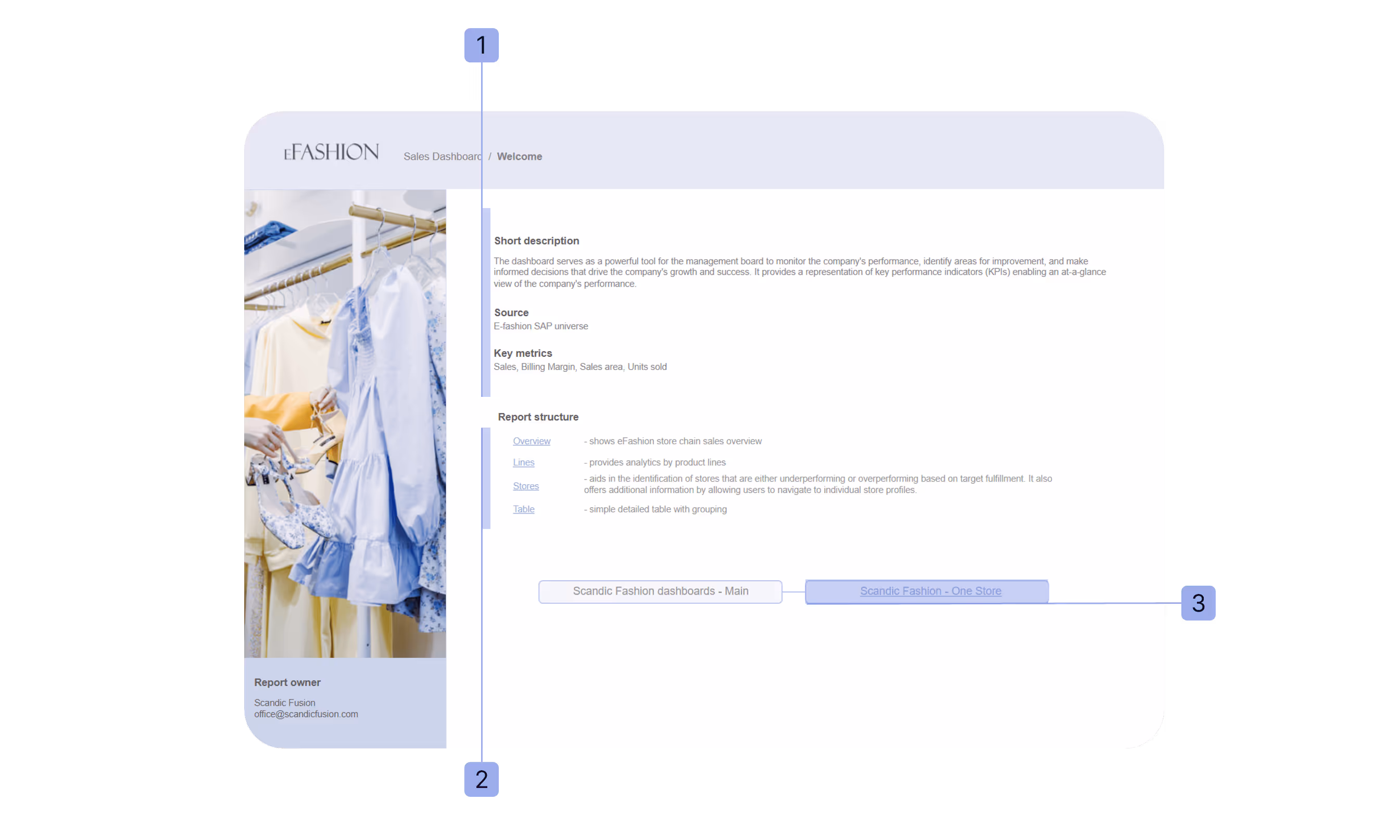
💡Hint: By uploading the image as a background, you can avoid unnecessary white space, and it will seamlessly blend with the page, regardless of its size.
This section covers the functionalities we found useful for dashboard usability and design.
Dynamic axes in charts enable users to adjust a chart's trendline granularity dynamically—such as switching between months and weeks—providing tailored analysis options within a single, space-saving visualization.
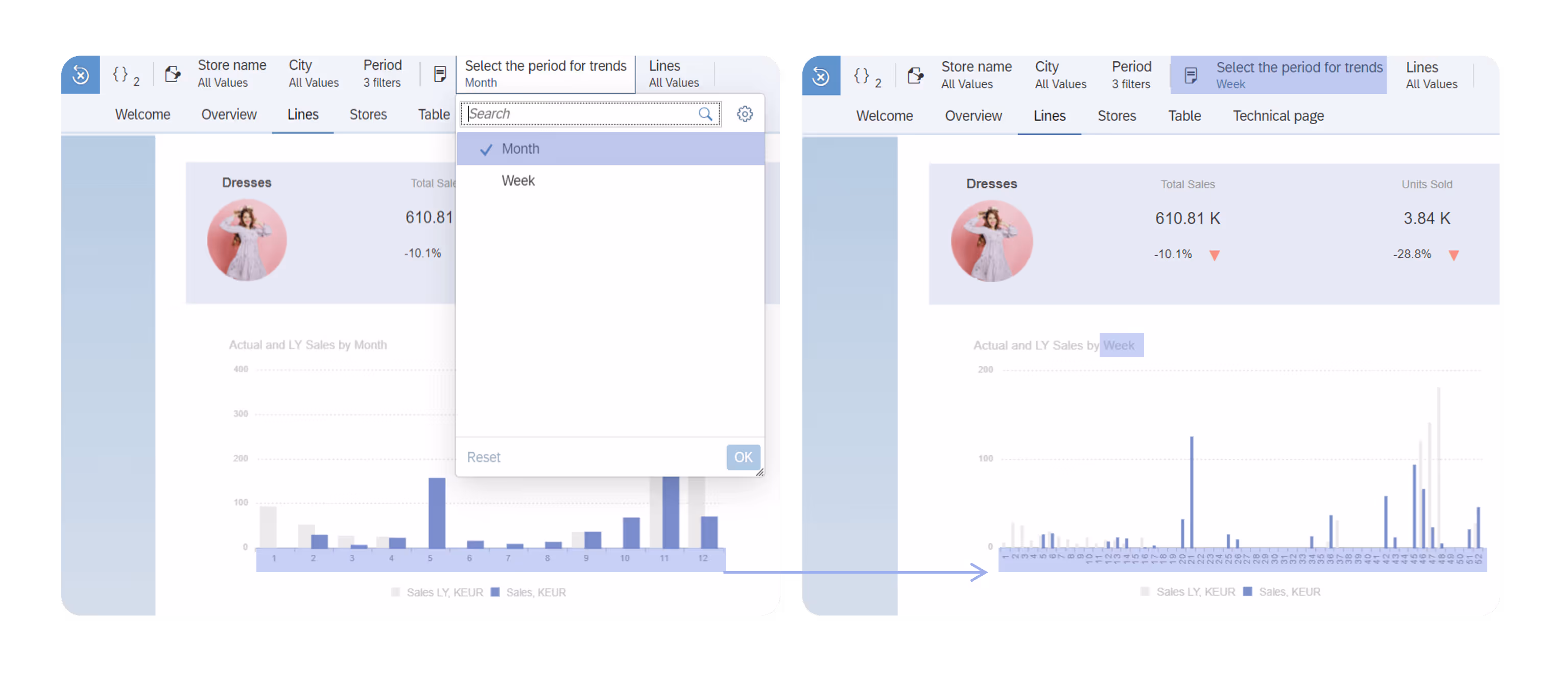
This capability is achieved using an additional attribute that dynamically adjusts based on the value selected in the input control. For instance, a sales team might view monthly revenue trends for a high-level performance overview but switch to weekly granularity to investigate the impact of a specific promotional campaign.
By combining flexibility with ease of use, this functionality makes visualizations more intuitive and actionable across a wide range of scenarios.
While switching between months and weeks is a common example, the flexibility of this functionality extends far beyond. It can be adapted to suit various use cases, such as toggling between product categories and individual products, regions and cities, or even fiscal years and quarters, depending on the specific analytical needs.
💡 Hint: To enhance clarity and contextual relevance, chart titles are also dynamically updated to reflect the selected granularity. This ensures that users always have an accurate understanding of the data they’re viewing, fostering a smoother analytical experience.
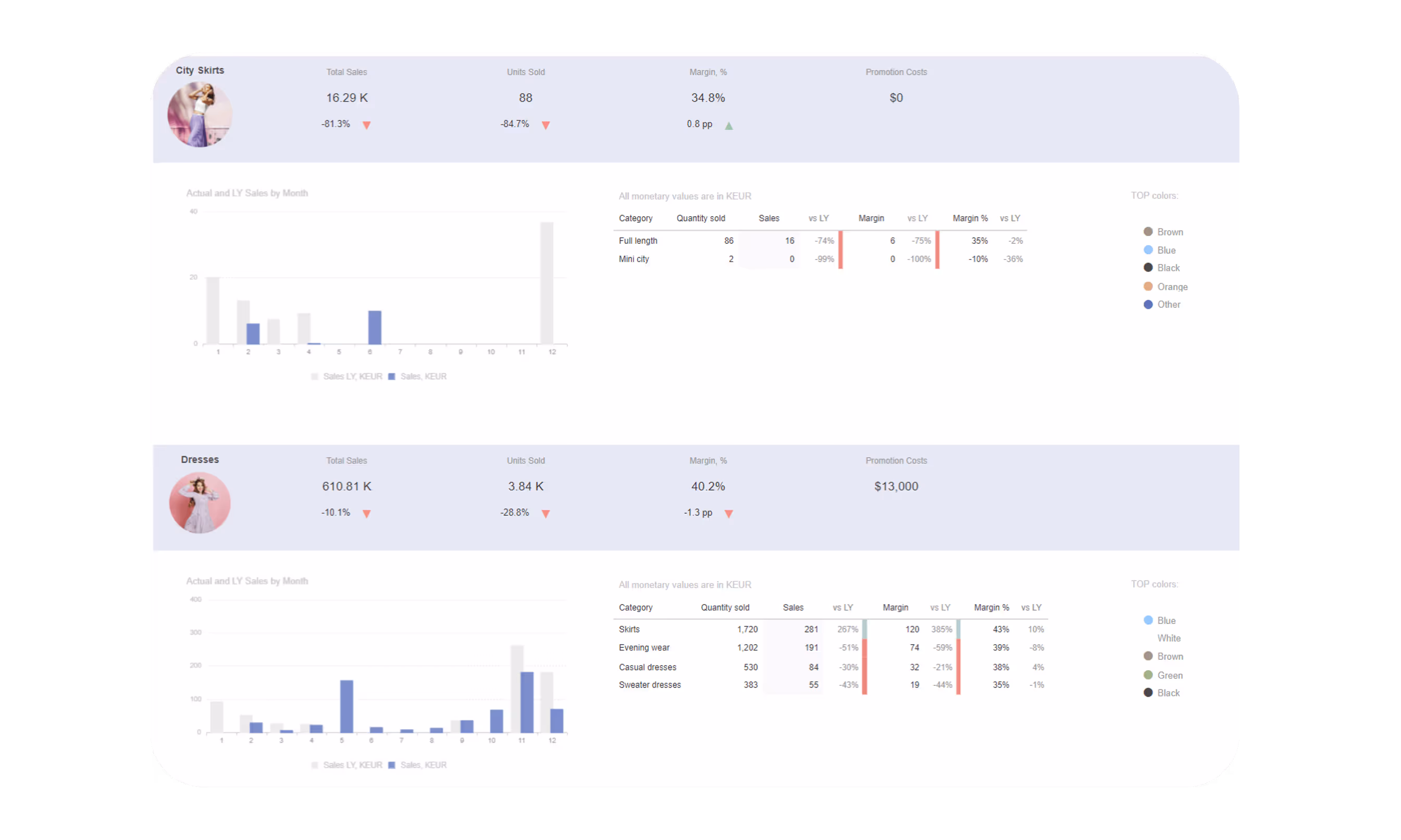
Using sections enables efficient presentation of the same content across multiple categories—in this case, clothing lines—while tailoring the display to reveal insights specific to each category. This approach significantly reduces implementation time, as the content structure remains consistent across all sections, yet each section dynamically reflects relevant information for its category.
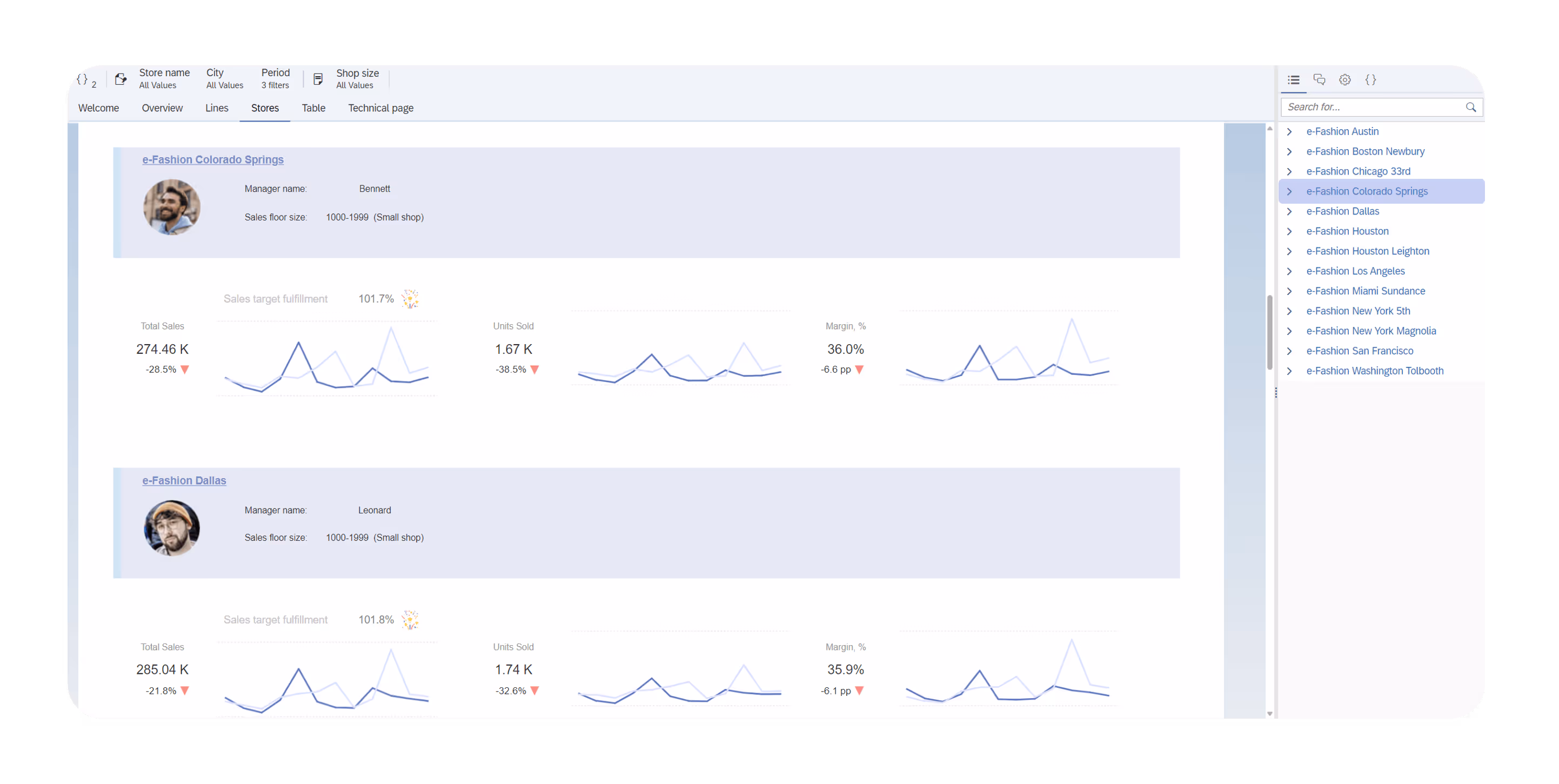
Additionally, sections improve usability through the section map, which provides an intuitive navigation panel on the right side. This navigation map allows users to quickly locate and focus on the section of interest, enhancing both efficiency and user experience.

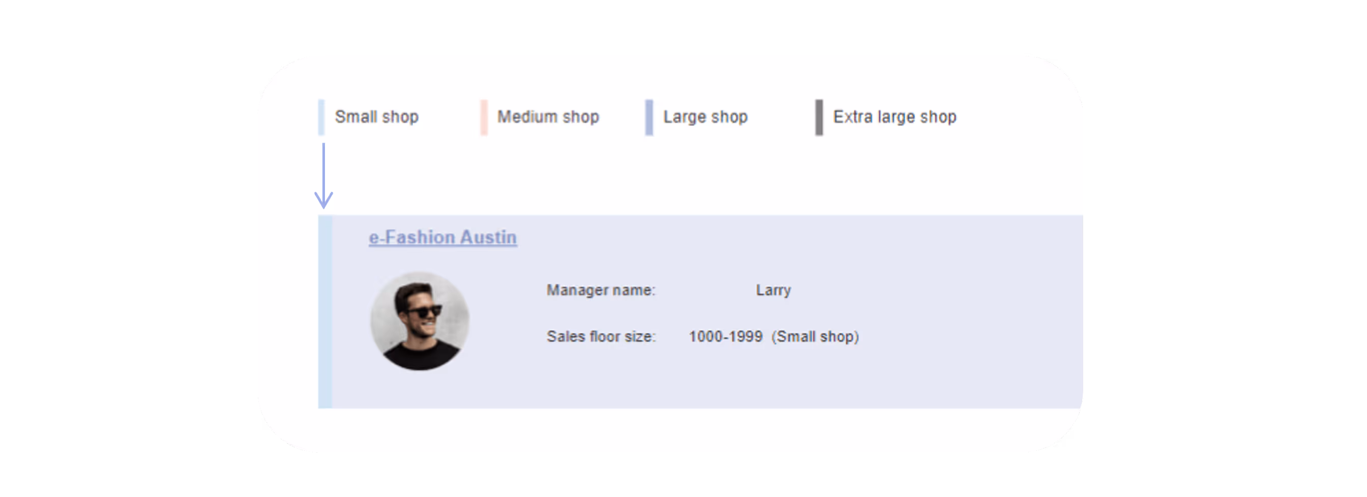
Typically, conditional formatting rules are applied to numerical or text values. However, here are some examples of non-standard applications:
To enhance the visual appeal and clarity of clothing line information, images are used to represent each line. These images are dynamically displayed using conditional formatting rules based on the values in the "lines" field, where each value corresponds to a specific clothing line. For example, if the line is "City Skirts," the rule ensures that the appropriate image is shown.

💡Hint: While conditional formatting is typically used to highlight differences—such as positive or negative values with green and red colors, it can also be applied to display images. In this case, it customizes the appearance of individual sections, improving their visual representation. Additionally, these rules can be reused across other reports within the same Webi document, ensuring consistency and simplifying the formatting process.
While KPI tile visuals can be used, tables offer a great option for displaying multiple KPIs, simplifying formatting, and customizing layouts.
In this example, the actual number is centered in merged cells, with two cells below showing a comparison to last year and conditional formatting icons.

Conditional background coloring enhances data clarity by helping users quickly spot outliers and patterns. Here are two practical examples:
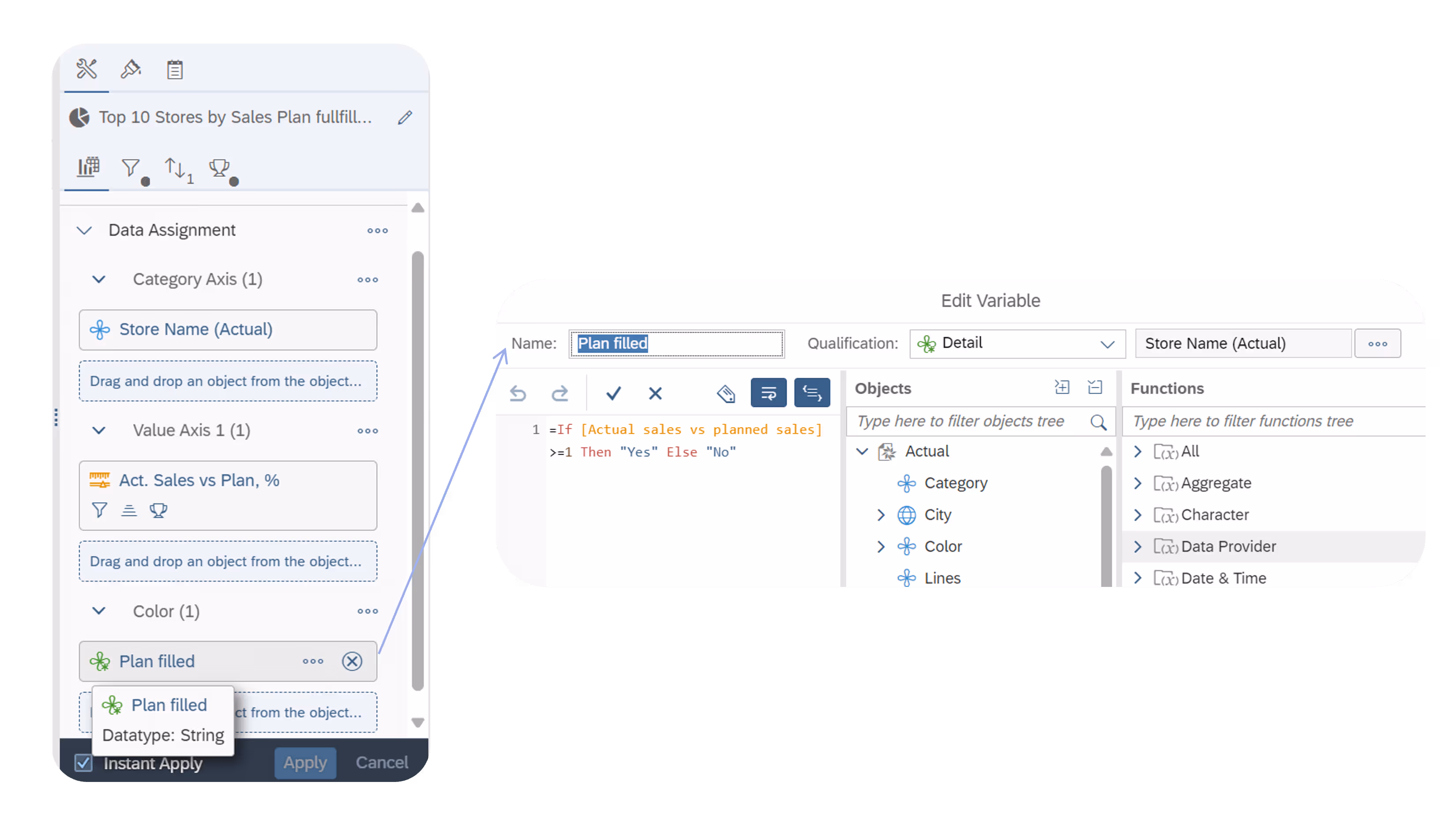
To highlight stores that exceeded their targets in the bar chart, we implemented a color-based approach.
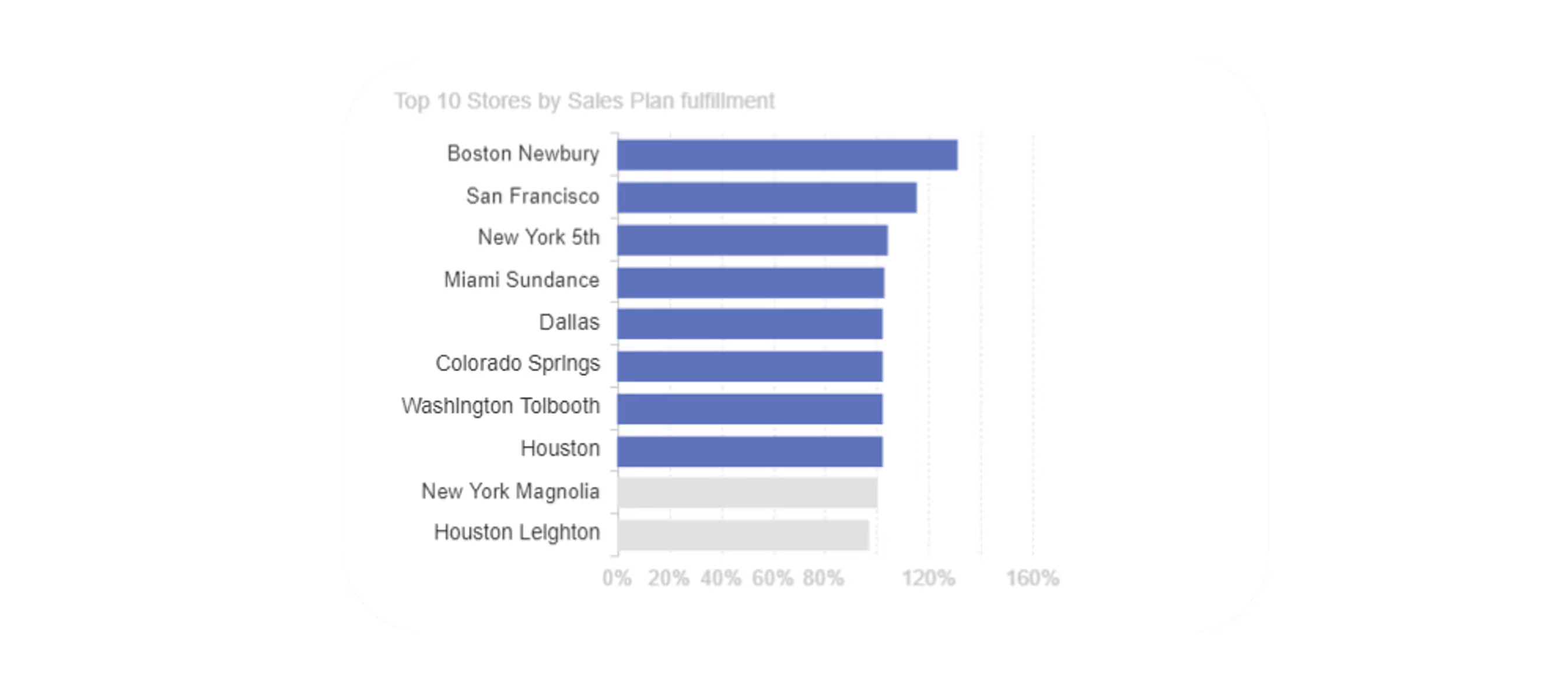
First, a formula was created to calculate whether each store met or exceeded its target. This formula was then used to define the color logic for the bars, ensuring that bars representing stores surpassing their targets appeared distinct.
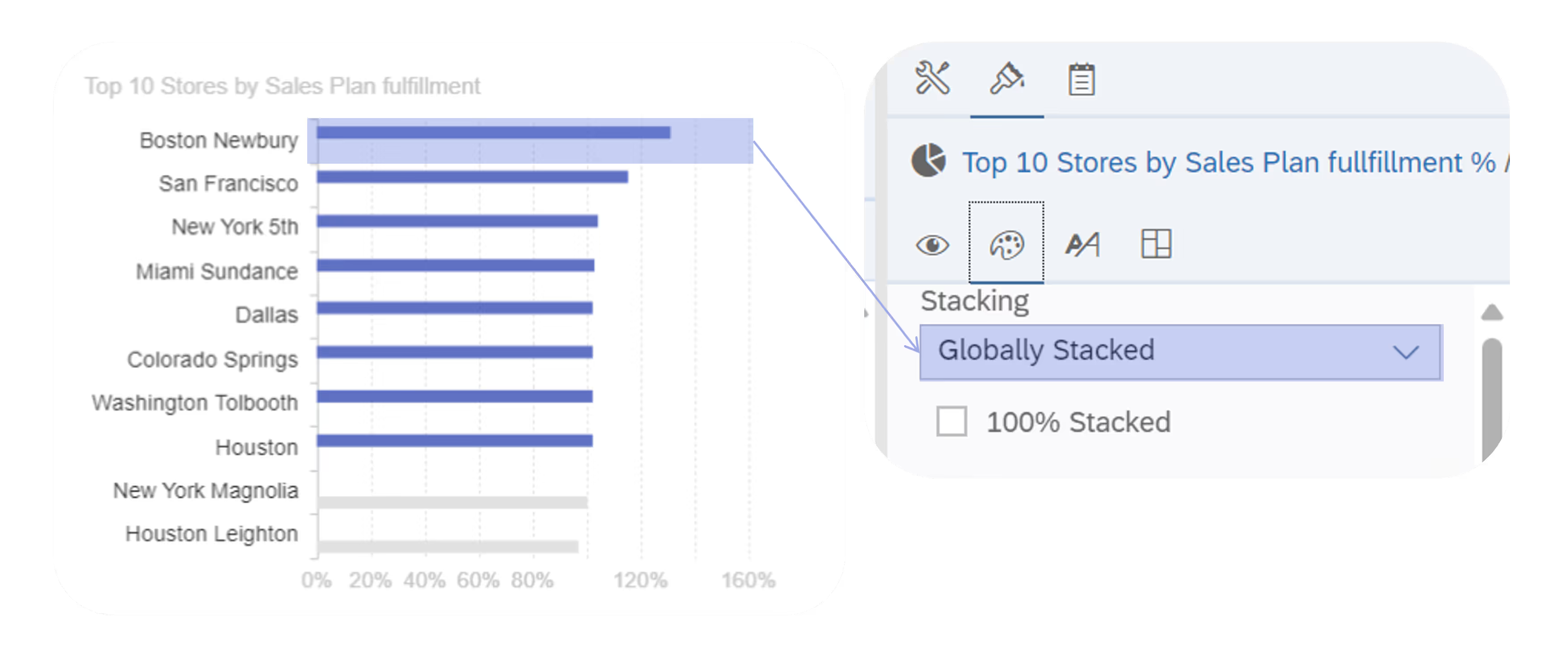
To maintain a seamless visualization without splitting bars into separate groups, the "stacked" option was enabled in the chart settings.
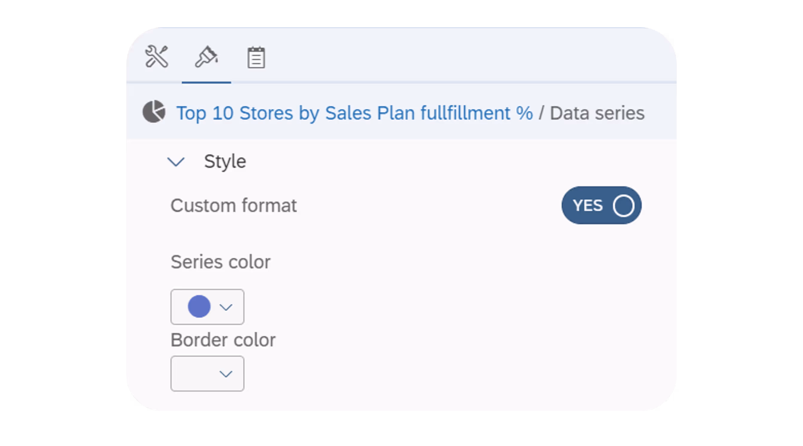
To ensure the desired color is applied when a target is reached, we used the custom format feature to fix the colors.
Cascading input controls functionality has been available for a long time, but it is a good reminder to always consider creating groups to have one filter depending on another.
In the example, when October is selected, only the relevant weeks for that month are displayed in the subsequent input control. This enhances the user experience by streamlining the selection process and reducing the likelihood of errors.
Industry:
Tech Stack:
Operating in:


.avif)

%20(1).avif)