May 21, 2025
•
Data Visualization
What happens when a brand book meets real-life dashboard design? At Scandic Fusion, we ran an internal experiment to find out. With participants from different roles and experience levels, we explored how brand guidelines influence dashboard consistency and where reporting-specific rules are essential.
At some point as the development team expands, you eventually realize that the company brand book doesn’t actually help much when it comes to creating reports that deliver a simplified, user-friendly experience.
A brand book is typically a document that outlines a company’s visual identity - like logos, colors, fonts, and tone of voice - to keep everything looking and sounding consistent across marketing and communications. But when it comes to dashboards and reports, it often leaves a gap. There are plenty of ways to structure things, place elements, or choose visual styles - and the differences in font or color choices can sometimes distract more than they help. That’s where reporting guidelines come in.
To explore this challenge (or maybe prove ourselves wrong), we kicked off a fun internal experiment: “When the brand book met reporting.” We asked employees from different roles, backgrounds, and experience levels to build dashboards based on various requirements and materials. The results gave us some valuable insights - and confirmed a few suspicions.
The goal of this experiment was to explore how different individuals interpret design and how the available materials are impacting the development of report.
In real-life scenarios, dashboards are often created by employees from various roles, not just dedicated designers. To reflect that, we gathered a diverse group of participants:

"I really enjoyed the experiment- it was fun, insightful, and the PBI example clarified a lot. Despite some time-related stress, the friendly atmosphere and well-chosen team made it a great experience. I'd love to join similar events again!
Artjoms Tukums, Project Manager at Scandic Fusion
In the first task, participants were asked to create a dashboard using a pre-prepared dataset and visualizations, following only the brand book guidelines - but with a challenge: they had just 15 minutes, simulating pressure to build a dashboard under a strict deadline.
Here’s what we found:

📌 Key takeaway:
A bit of individual style can be great, but if a company wants consistent, on-brand reporting, the brand book might not be enough on its own.
"For anyone thinking about internal dashboards, I’d say it’s a must to align them with your brand book. That document carries the vibe and personality of your brand, and consistency, both externally and internally, and it really matters.
But while the brand book is the foundation, it’s not the full story when it comes to reporting. Dashboard guidelines are a necessary extension of your brand—tailored specifically for the unique use case of data visualization and reporting.
Going into the experiment I did hope our brand book would be enough to make reports look cohesive… and I was quickly proven wrong. Even a more detailed brand book likely wouldn’t cover everything dashboards require, like extended color palettes for data-heavy visuals, spacing principles, layout rules, or guidance on which chart types to use and when.
That’s where dashboard-specific guidelines come in. They’re not a ‘nice to have’—they’re essential if you want your internal reports to look and feel like they truly belong to your brand.
Luīze Sila, Marketing & Communications Manager at Scandic Fusion
The second task was more instinctual. We gave participants a sample dashboard page filled with intentional design flaws - mismatched formatting, poor color contrast, confusing layouts - and asked a simple question: “What don’t you like?”
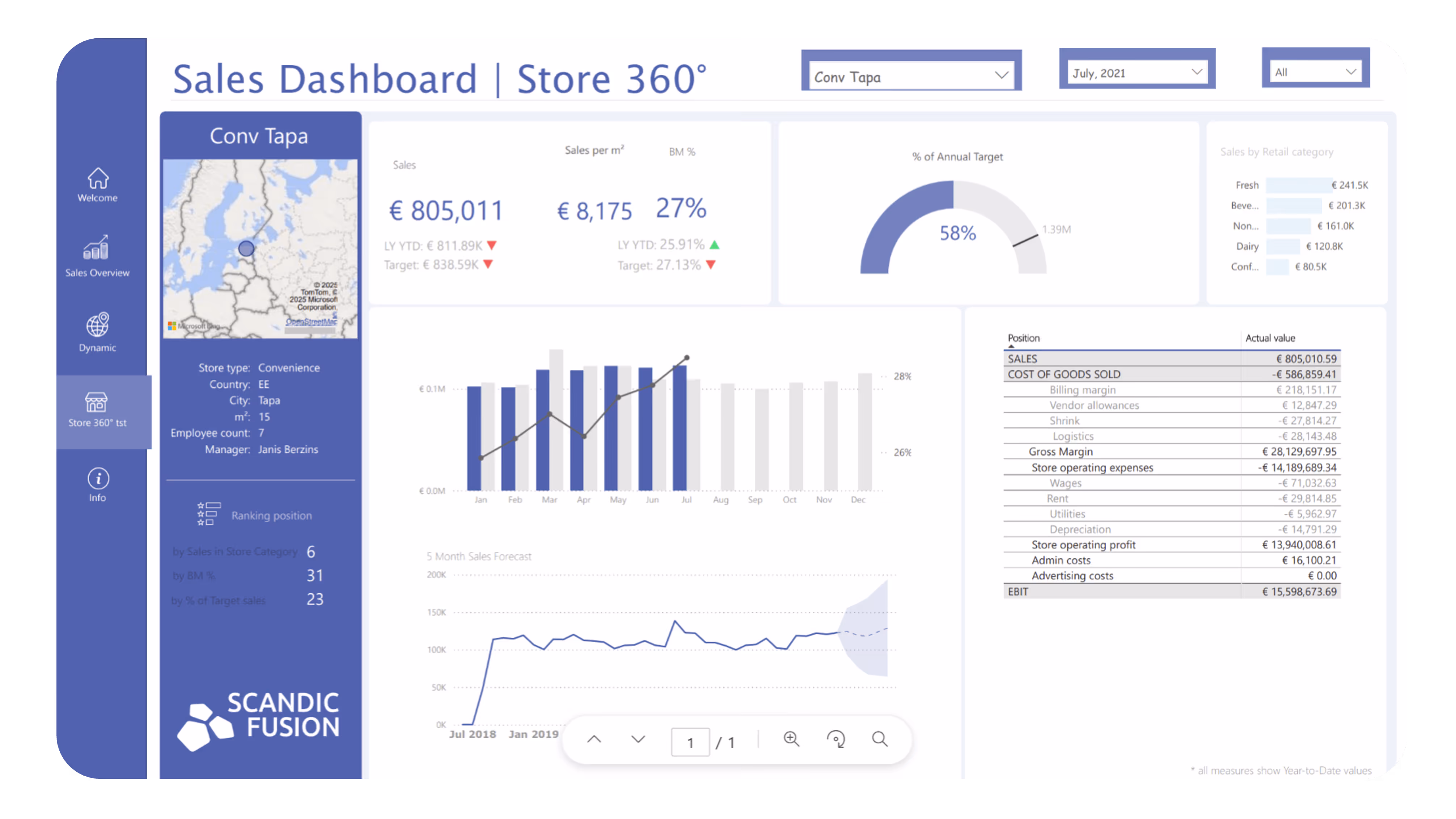
Their responses were compiled into the table below, showing how many participants identified specific issues:
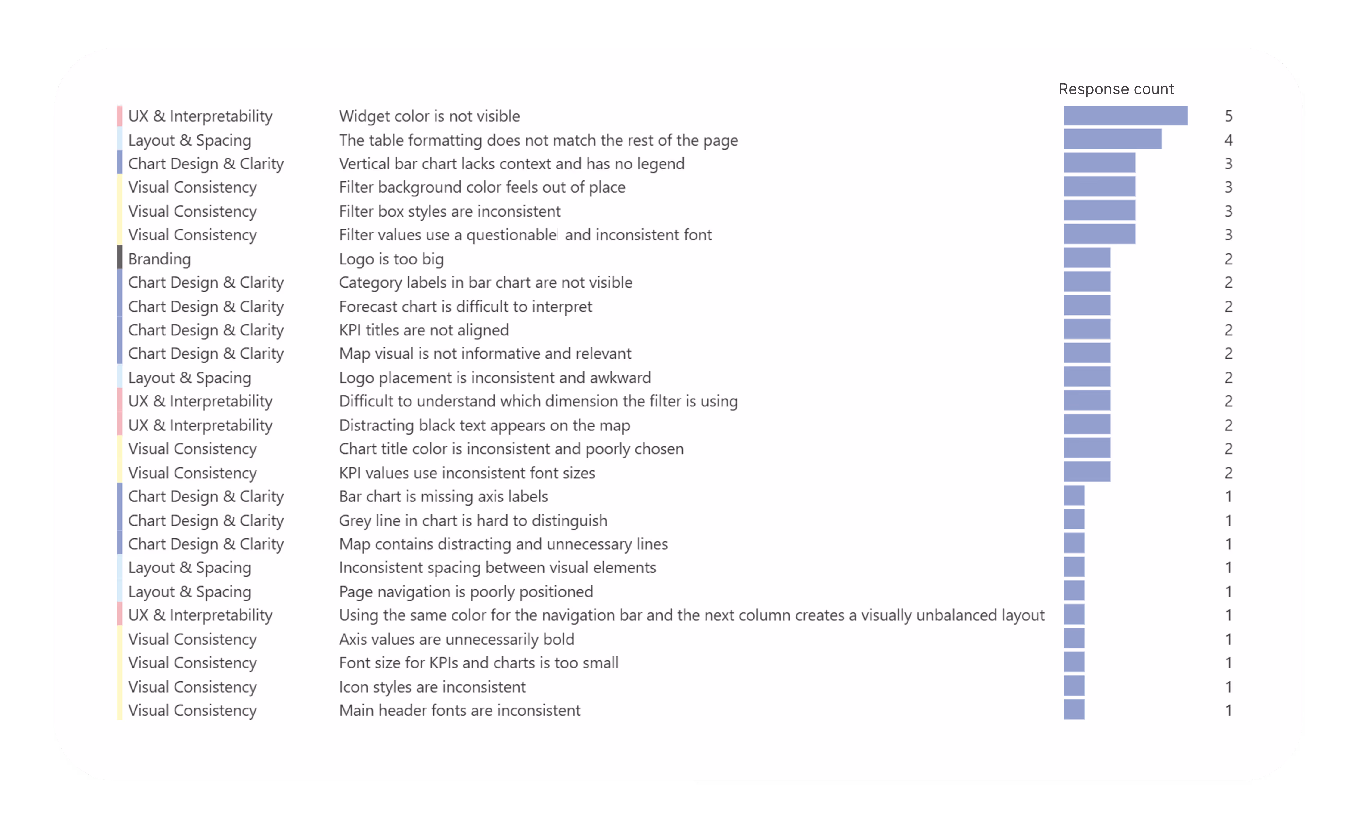
Most commonly flagged issues were:
Of course, here subjectivity played a huge role. While some users noticed font inconsistencies, others were more sensitive to layout or color balance or the content itself.
🧠 Key takeaway:
Common issues - like poor color contrast, inconsistent formatting, and mismatched filters - were frequently mentioned, yet each participant had their own perspective on what stood out most. This highlights that while some problems are clearly visible to everyone, others are more subjective and depend on individual perception.
In the third task, participants were asked to review the same dashboard again - but this time with the support of our newly introduced internal reporting guidelines.
Reporting guidelines are a set of standardized rules designed to ensure that dashboards and reports maintain a consistent visual style and user experience. They cover aspects like layout, color usage, typography, spacing, and data visualization best practices, ensuring that reports are clear, intuitive, and aligned with the brand.
What has changed?
The feedback was more precise. Participants easily pointed out:
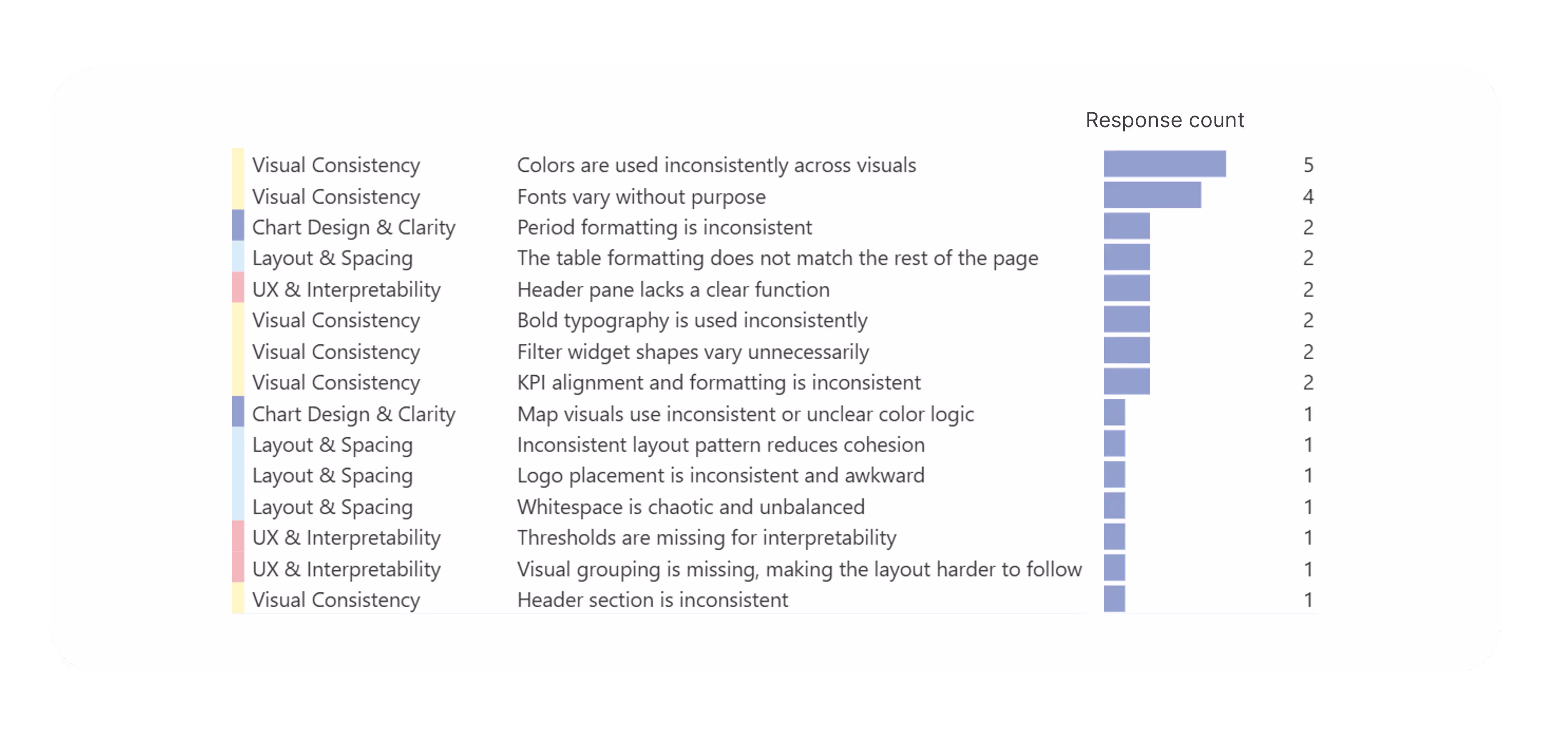
But more importantly, the guidelines helped surface new issues that hadn’t been consistently mentioned before, such as:
🔍 Key takeaway:
Guidelines validated previously “gut-feel” feedback: Things that “felt off” in earlier tasks - like spacing or alignment - were now being expressed in clear terms, backed by rules.
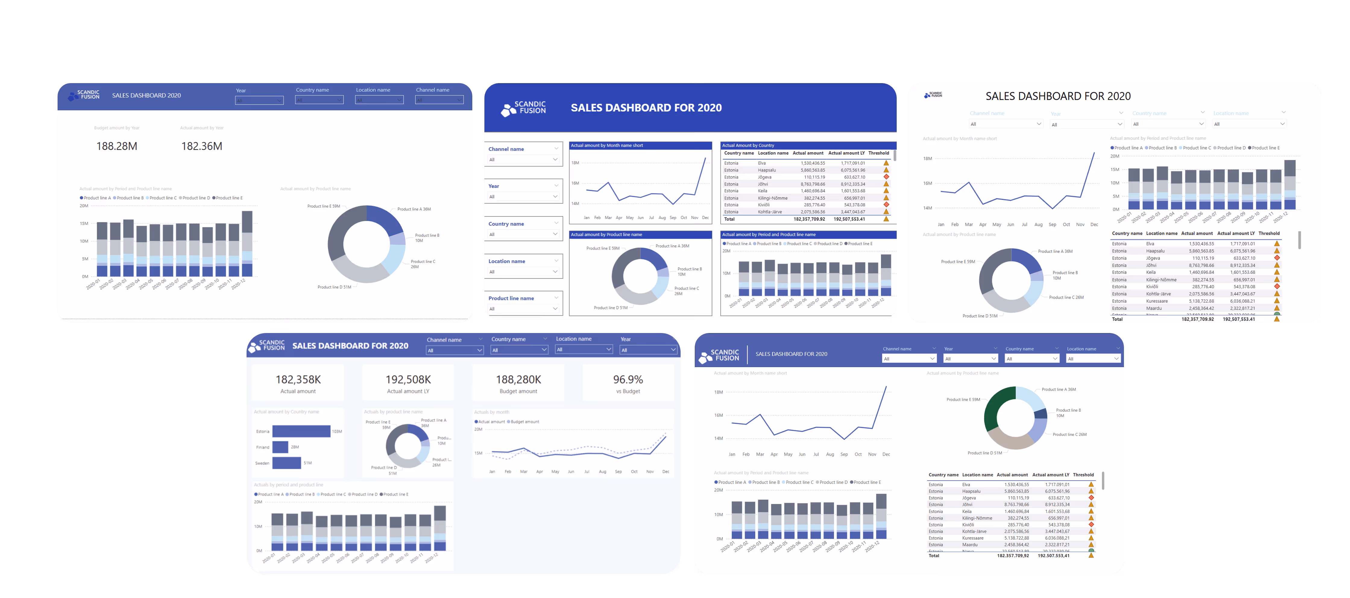
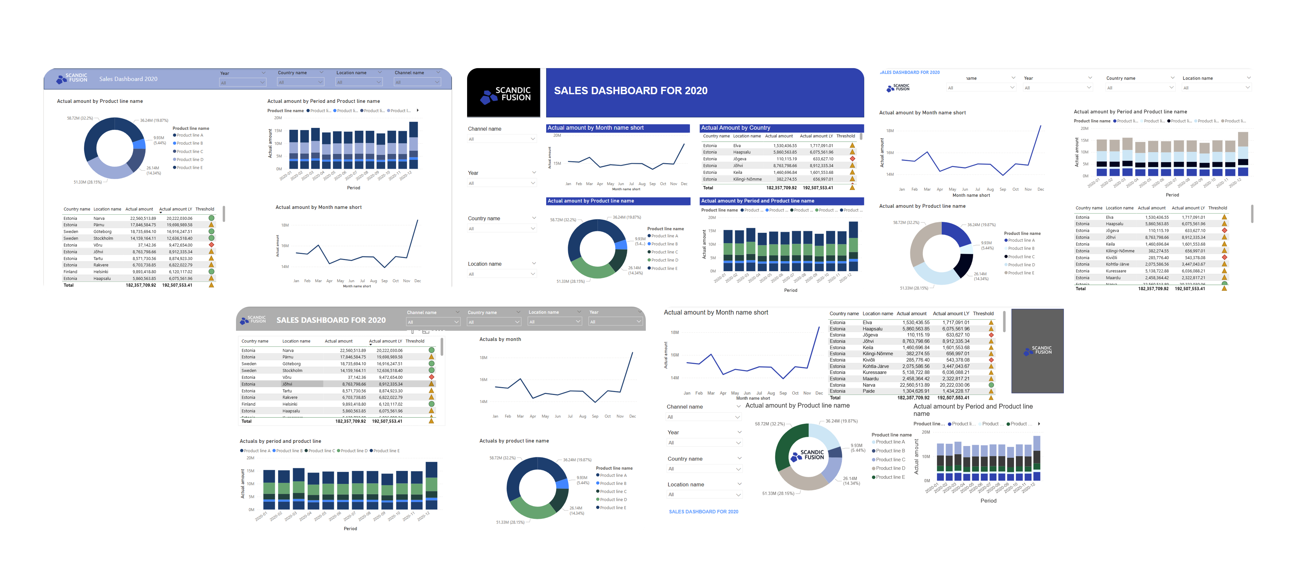
To close out the experiment, we gave participants one final challenge: Take your original dashboard and adjust it according to the reporting guidelines - within just 15 minutes.
This task wasn't about perfection. In fact, some participants had only limited experience in report formatting or design tools. Instead, our aim was to see what kind of impact clear, structured rules could make in a short amount of time, even for non-designers.
To support the task, we also provided a shared Power BI theme, making it easier to apply the guidelines quickly and ensure a more aligned visual starting point.
Here’s what emerged after those 15 minutes:
🔑 Key takeaways:
"
As a someone new to Power BI, I have discovered that two things are equally important:
• Guidelines that help define the vision for the final report outcome.
• Technical knowledge to be able to realize this vision.
Sandis Dzērve, Data Analytics Developer | Architect at Scandic Fusion
We hope this experiment serves you as an example that even people who are immersed in the world of dashboard on a daily basis can create very different outcomes. To help you overcome this challenge, our next blog dives into:
Whether you’re just starting to systematize your design process or refining an existing one, these insights will give you practical strategies to boost both the clarity and quality of your dashboards.
Industry:
Tech Stack:
Operating in:


.avif)
%20(1).avif)