May 21, 2025
•
Data Visualization
Having a brand book is great but when it comes to dashboards, it’s rarely enough. In this follow-up to our internal design experiment, we explore why reporting needs its own set of guidelines. From structuring layouts to managing cross-platform consistency, this post offers practical advice, examples, and steps to help organizations create and sustain reporting design standards that truly work.
In our last blog post, we explored an internal experiment that confirmed a familiar challenge: brand book can’t guarantee consistent dashboard designs. Even with a brand book in hand, our team produced dashboards that looked quite different.
So, how can organizations achieve true consistency in reporting? This blog post takes a deeper dive, exploring:
Whether you’re designing dashboards or overseeing reporting standards, this post will help you bridge the gap between brand identity and clear, consistent visuals.
.avif)
There’s a lot to appreciate about having well-defined reporting guidelines. They serve as both a foundation and a framework for producing dashboards:
✅ A better user experience
When dashboards follow consistent layouts and logic, users navigate them more easily. A familiar structure reduces cognitive load and keeps the focus where it belongs - on the data.
✅ Solid results without design expertise
Perhaps the biggest win: clear guidelines empower individuals without a design background to create professional, well-structured dashboards.
✅ Saves time – even for pros
No need to reinvent the wheel. Developers save time by avoiding the need to design from scratch. With guidelines in place, they can quickly implement visually appealing designs.
✅ Guidelines as inspiration
Rules can fuel creativity too. By outlining when and how to visualize different types of data, guidelines can act as a starting point for creativity, especially for less experienced designers.
✅ Ready for reuse across formats
Dashboards built with guidelines are presentation-ready. Whether it’s a management deck or a mandatory monthly, quarterly, or annual report, charts and tables can be reused without extra design work - saving time and keeping things consistent.
"What helped me the most and what I loved was the sample dashboard within the guidelines. I wish there were more samples for inspiration.
Monta Berķe, Data Analytics Consultant at Scandic Fusion
.avif)
As valuable as guidelines are, they’re not without their challenges - and a few trade-offs should be acknowledged.
We’ve grouped the most common ones into two categories: those typically faced by dashboard developers, and those that affect the organization as a whole.
⚠️ Potential creativity blockers
While consistency is key, strict rules may discourage fresh thinking. New or better design solutions might get overlooked simply because they fall outside the prescribed format.
⚠️ Practicality vs skill level
Not all guidelines are easy to follow - especially for users who aren’t fully confident with the BI tool. When formatting feels complex or time-consuming, even well-meaning developers may skip steps. That’s why it’s important to pair design standards with strong tool training and offer simplified alternatives where possible. The easier it is to do things the “right” way, the more likely people are to actually do it.
⚠️ Design fatigue and boredom
When every report starts to look the same, there's a risk of visual monotony. Both creators and users can become disengaged if dashboards begin to feel too templated or repetitive.
⚠️ Guidelines need regular updates to stay relevant
Design trends shift, BI tools evolve, and design standards change - so your dashboard guidelines need to keep up. What worked two years ago might feel outdated today.
To stay relevant and effective, guidelines should be treated as a living document, regularly reviewed and refined. This keeps them practical, visually current, and aligned with both user needs and tool capabilities.
⚠️ Brand vs reporting guidelines
One common challenge is reaching an agreement with the marketing team on style differences. Sometimes, it’s necessary to make compromises, balancing between brand colors and best practices for data visualization.
For example, a brand's primary color (like green) might clash with its typical use in data for signaling success, requiring compromise and communication across teams.
⚠️Tool diversity and compatibility
When multiple BI tools are in use, it can be difficult to enforce consistent standards across platforms. Each tool may have different capabilities, limitations, and formatting logic.
Step-by-step process for building reporting standards:
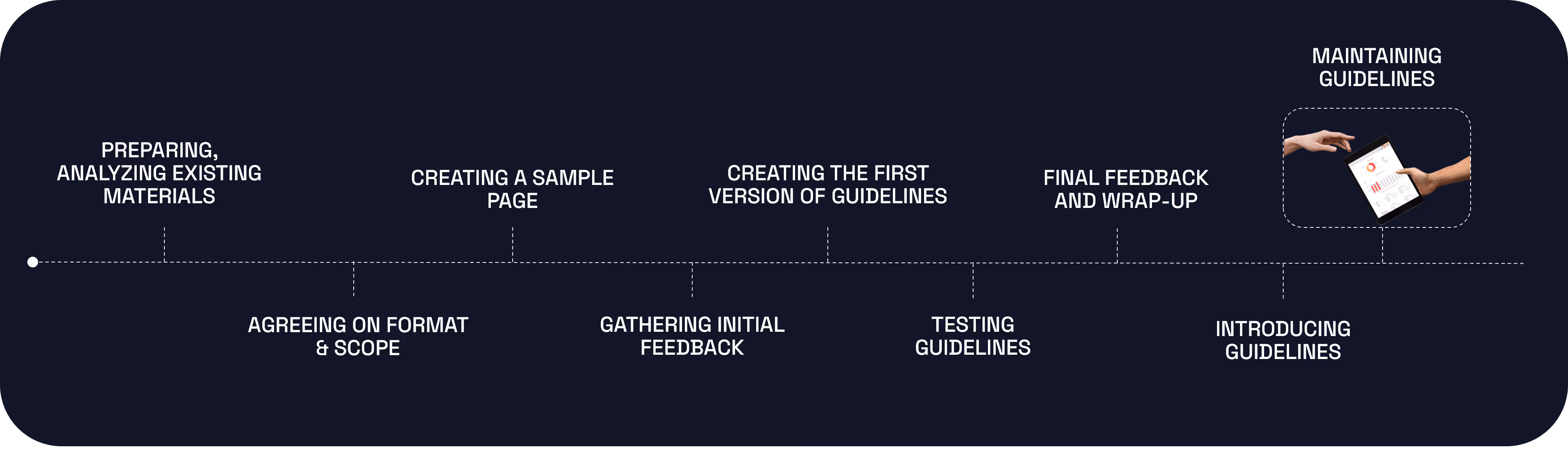
Exploring existing brand books, style guides, presentations, and any other related materials to ensure consistency.
Before jumping into design work, define the scope of the guidelines (e.g., which types of visualizations, tools, or platforms will be included). Then, choose the most practical format for sharing them across the organization.
It may seem modern to host your guidelines directly within a BI tool, but there are trade-offs to consider:
💡If BI tool limitations seem restrictive, a dedicated guideline document or example dashboard might be a better option. A sample dashboard (which can be a real, functional report) is often the most intuitive reference - especially if it’s accessible to everyone and mirrors real use cases.
Developing one or more sample dashboard pages to test the overall look and feel.
💡Document all alternative versions and preserve any unsuccessful trials for reference.
💡 Collaborate with marketing or design team to maintain visual harmony, but remember: a reporting guideline serves a different purpose. While the brand book focuses on external messaging, reporting guidelines must optimize data clarity, performance, and usability.
Presenting initial design samples to stakeholders and collecting detailed feedback.
💡 Always seek clarification, asking for the underlying reason behind the design preferences. Document these insights to ensure clear understanding. An individual design element may initially appear unpleasant or out of place. However, its impact can change significantly when viewed within the complete design or when other elements are adjusted.
Develop the first complete version of the guidelines, incorporating initial feedback.
💡The primary users of your guidelines - often dashboard designers, developers, or analysts - need clarity and replicability. However, design principles should be straightforward enough for someone without a design background to follow.
Professionals may follow rules more strictly, but regular users are often juggling deadlines and just trying to deliver a report that was due two days ago. For them, the guidelines need to be practical, time-saving, and easy to apply without requiring deep design knowledge.
Test the guidelines with a real project, ideally with another developer who has not been involved in the guideline creation.
Collect final feedback, make necessary adjustments, and finalize the first version of the guidelines.
Establish a process for regularly reviewing and updating the guidelines to maintain relevance.

While our experiment clearly showed that guidelines can elevate reporting quality, here’s the truth: just having them isn’t enough. Here are some suggestions to better support the use of guidelines:
We invite you to explore our customer case studies, where organizations have successfully implemented reporting consistency guidelines across various platforms. Here are a few examples:
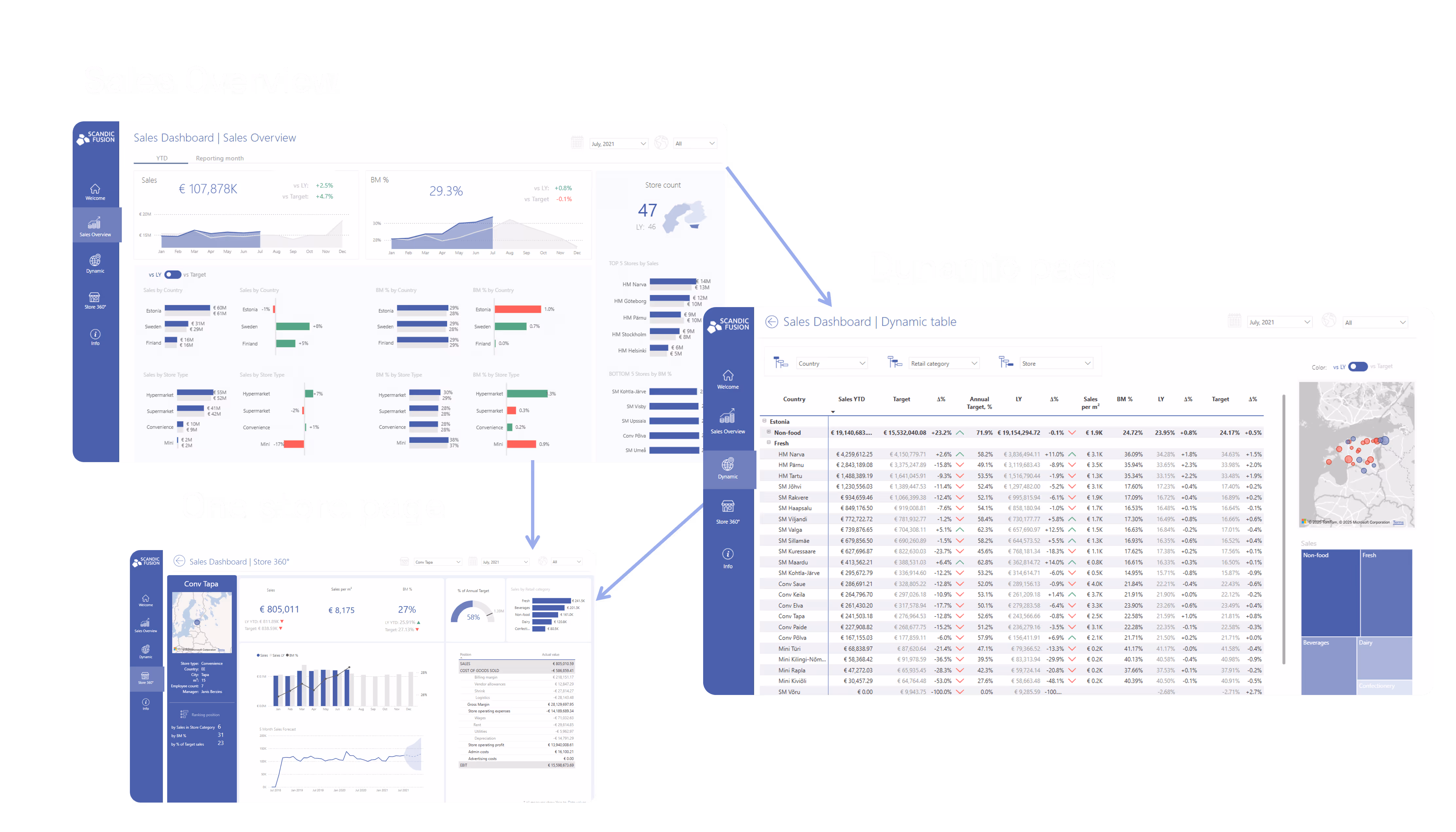
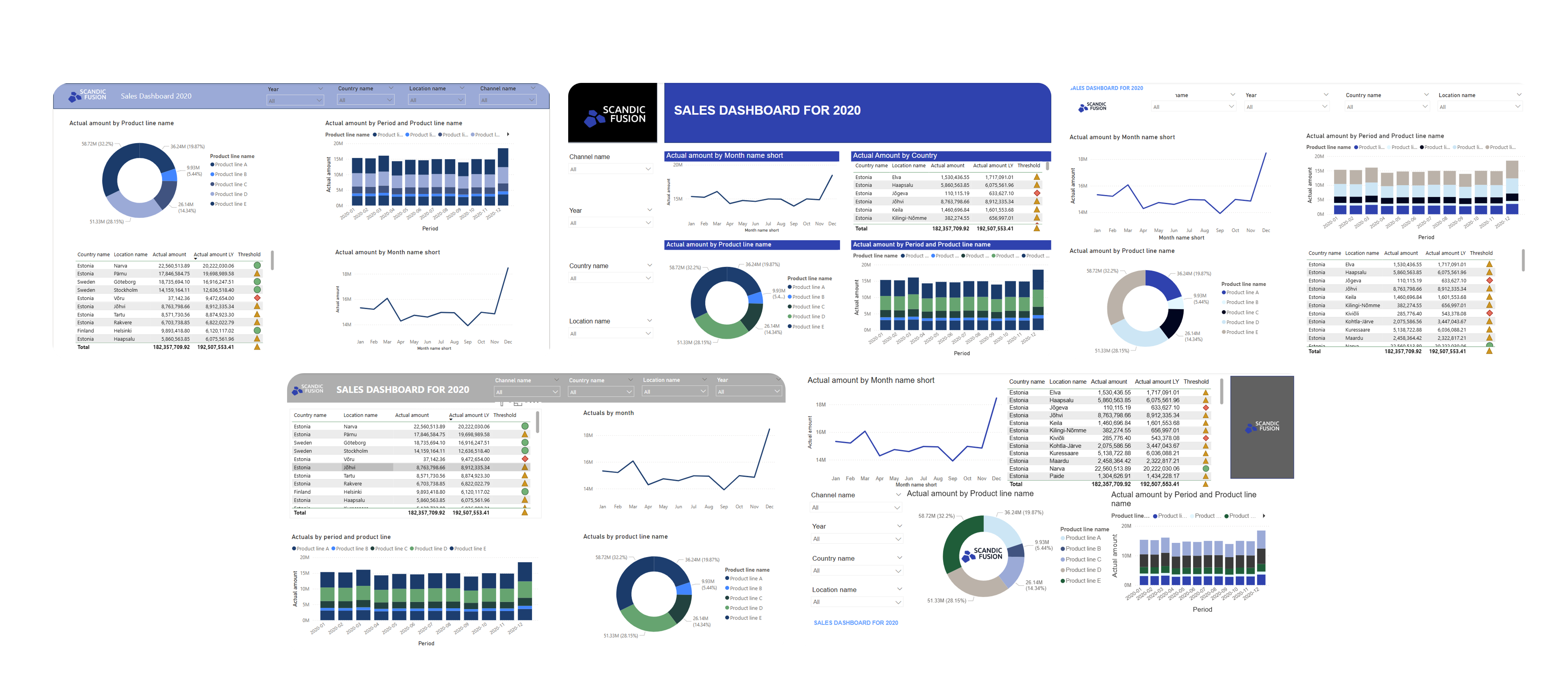
For our internal needs the guidelines were implemented directly within the Power BI tool. Below, you can explore some of the sample pages from the Scandic Fusion guidelines designed by Ilze Lulle:
{{slider}}
And here is a sample dashboard aligned with the design from guidelines.
Check out the sneak peak video showcasing the dashboard story.
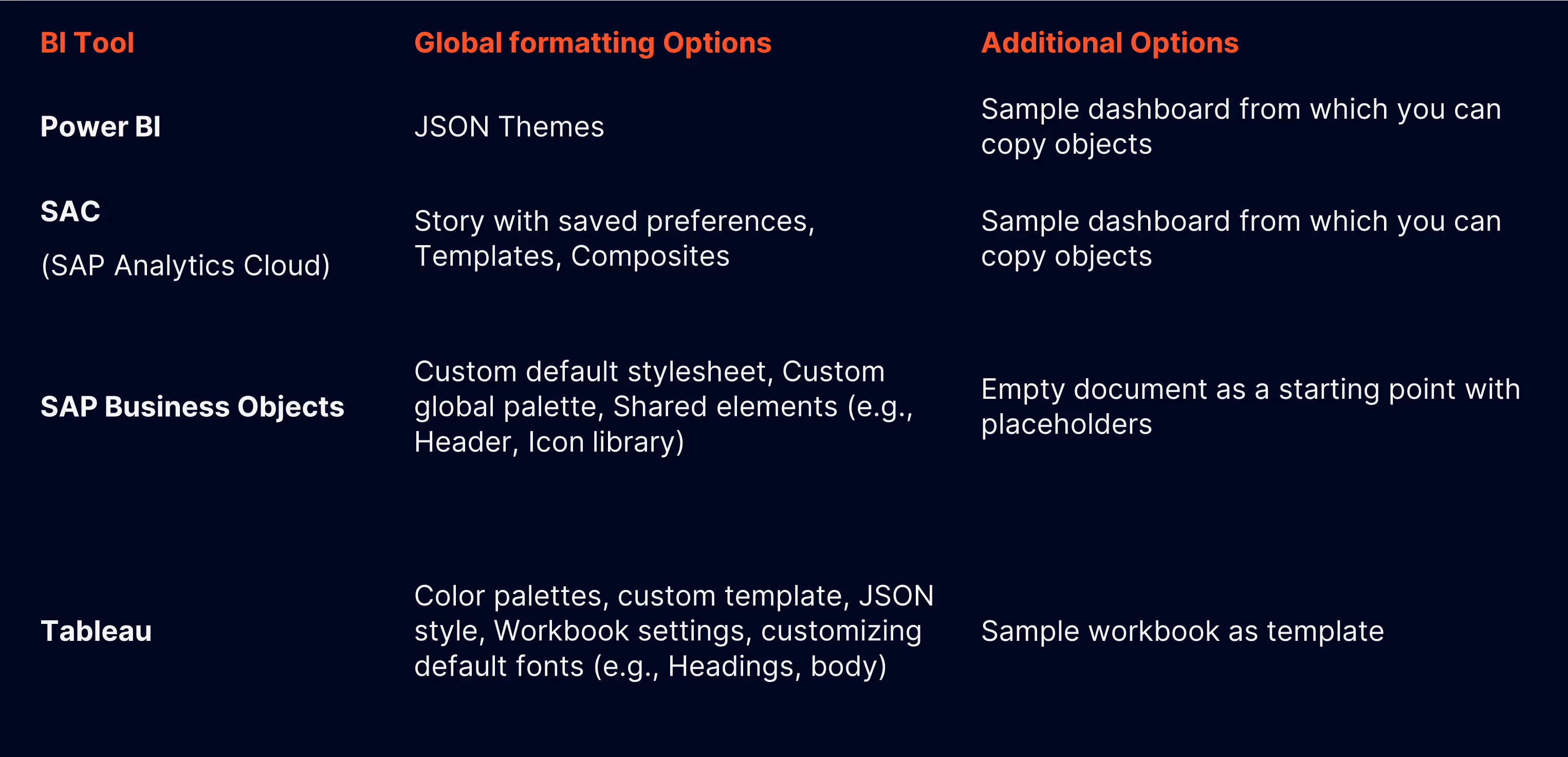
Here is a table that summarizes the capabilities of the most used BI tools for our customers:
Whether you're starting from scratch or refining existing reports, we can help you design dashboard guidelines tailored to your organization’s tools, users, and brand. Get in touch for a customized proposal and create a consistent reporting experience your whole team can rely on.
Industry:
Tech Stack:
Operating in:


.avif)
%20(1).avif)