October 21, 2025
•
Planning
Planning in SAP Analytics Cloud can be powerful but also complex. At Scandic Fusion, we have refined SAP’s Rapid Financial Planning suite to create an extended planning demo that connects sales, workforce, and financial models into one intuitive workflow. Here’s how we built it and the best practices we recommend for seamless, user-friendly planning in SAC.
SAP provides a wide array of pre-built content that allows users to quickly load data from S/4HANA into ready-to-use models and start planning in ready-to-use stories. We used the Rapid financial planning suite from SAP as a basis for our own extended financial planning demo and refined the models and stories to showcase the best practices of SAP as well as the best practices of Scandic Fusion.
Our planning demo combines three models that represent separate parts of the planning workflow, which feed into each other. Users can perform sales and workforce planning in dedicated stories. The end results of those plans are fed into the financial planning model, where final top-down adjustments can be made.
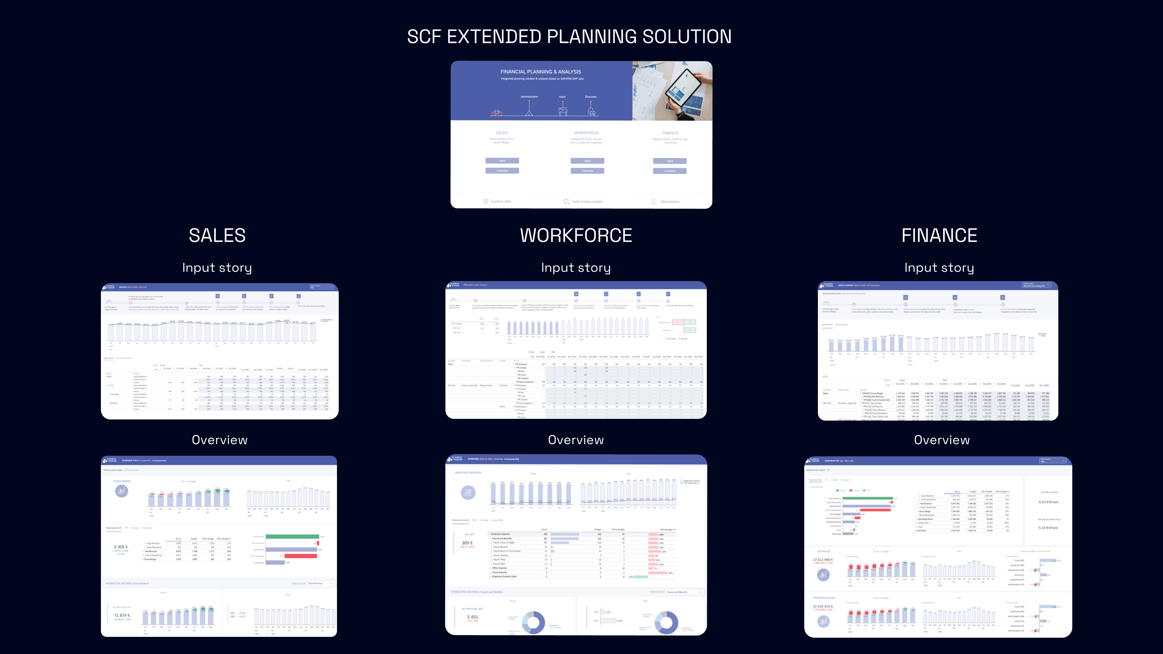
Planning models in SAP Analytics Cloud can be integrated with each other. In our extended financial planning demo, some values in the top-down financial planning model are taken from the sales and workforce planning models, where the plans are adjusted at a finer level of detail.
For instance, the initial gross margin plan in the financial planning model is aggregated from the sales planning model. In it, each product has a plan for sales quantities, prices and costs, and those values are used to calculate the total revenue, costs, and gross margin at company level. The financial controllers can then execute a data action that transfers the aggregate of sales planners’ input as a basis for their gross margin plan. In the financial planning model, adjustments can still be made to these aggregated numbers.
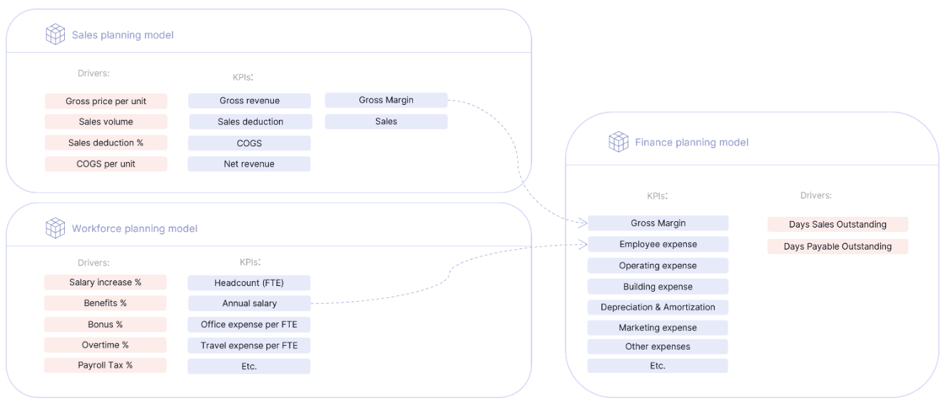
Similarly, when employee counts and per capita expenses (including taxes, bonuses, office costs, and other expenses) are finalized in the detailed workforce planning model, these amounts can be aggregated and moved to the financial planning model by using a data action. Just like with the sales figures, adjustments can be made to the aggregated employee expenses in the financial planning model.
This approach is beneficial because the figures in each model are planned at the appropriate level of detail. A detailed workforce expenses plan improves the overall accuracy of this profit and loss position, but the financial statements are not relevant at employee position or office location level, so they are aggregated.
Improving the planners’ experience means putting some extra attention into story design. Since planning solutions can involve complex flows and multiple actions, smart story design plays a key role not only in structuring planning forms but also in guiding navigation, highlighting available actions, and giving clear hints on what users can do next.
To achieve an intuitive planning experience, we apply the following story design best practices:
In our planning demo, we use a welcome story that serves as the starting point. From that story, you can navigate to any of the input and overview stories, you can navigate to a page showing an overview of the planning solution models, and there are useful links to relevant parts of SAC that cannot be accessed via stories (currency conversion tables and data changes log).
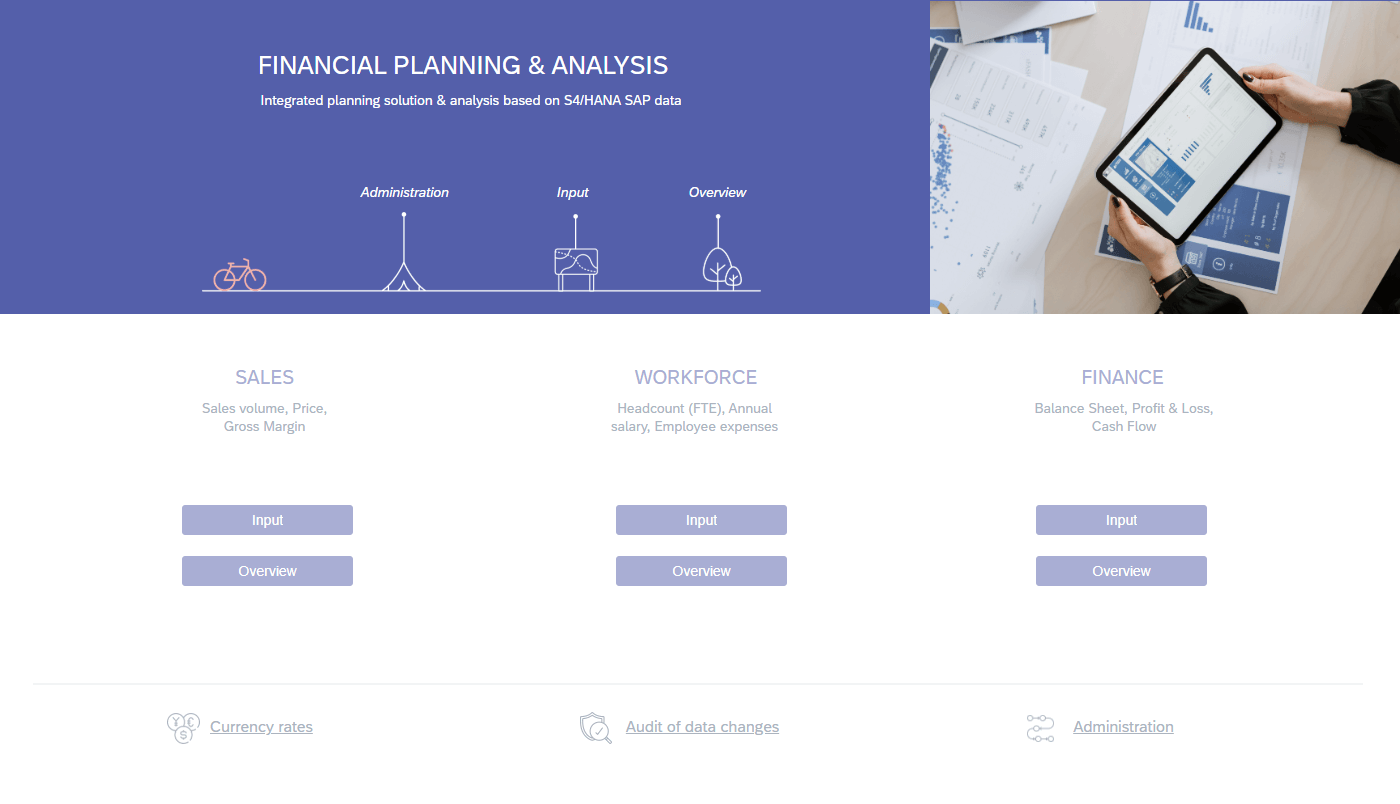
Every story has its own welcome page that shows users more information about the pages that are available in the story. While the in-built SAC page navigation drop-down menu is still available, it is limited to only showing page names. A welcome page can include more relevant information and can be designed in a visually appealing way.
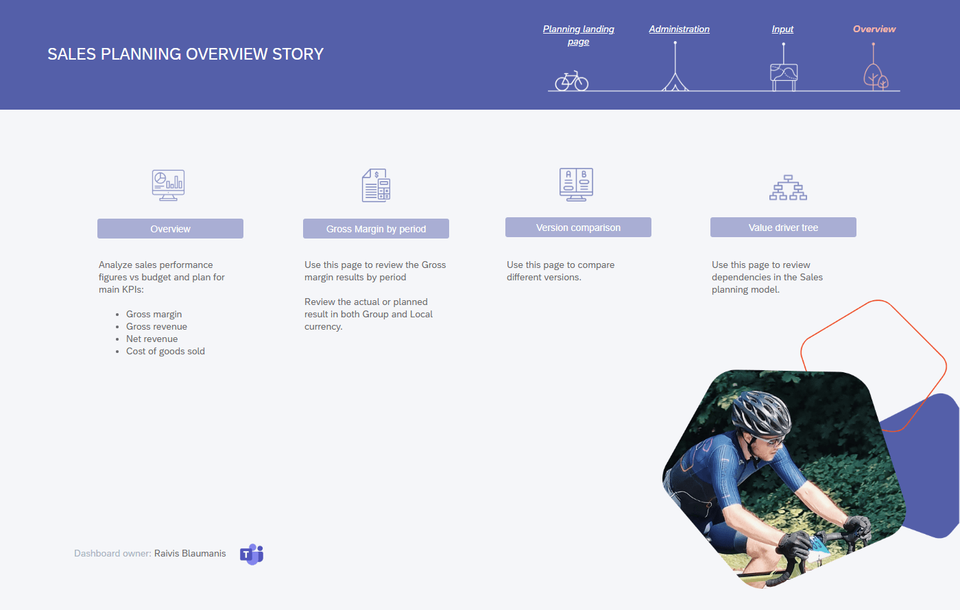
Navigation panels are added to all stories and pages. This allows users to easily move between pages and stories. Panels can also be used to provide page-specific instructions and process flows that aid the user.
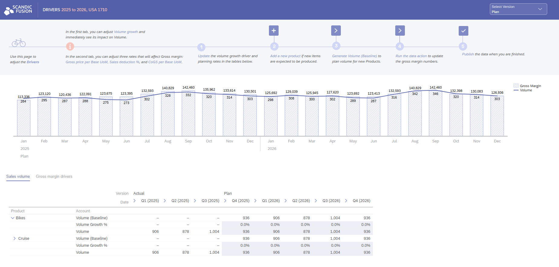
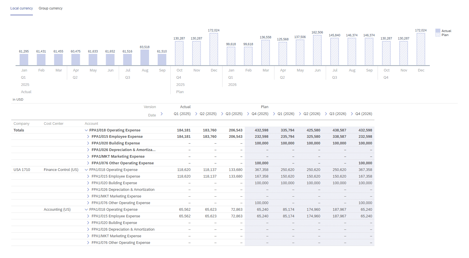
Keeping story design consistent makes not only for a beautiful user interface, but it also helps the user navigate by creating instant familiarity with new pages. In SAC, it is possible to set up a table so that input cells are colored differently, which acts as a visual aid to the user. If there is a chart next to the input table, you can extend color coding to it as well to visually separate actuals and plan.
When designing input tables, you can use forecast layout to combine actual data and plan entry in one table. This provides the user a quick reference for what values might be reasonable for the selected subset of data. To further help the user quickly grasp the numbers, you can add a time series chart that will make unusual or erroneous data stand out.
For specific needs that are not covered by standard SAC functionality, JavaScript capabilities can be used. For example, it’s possible to create a pop-up that allows the user to create new dimension members – be it a new product, a new employee position or a new office location. It’s also possible to set this pop-up to automatically execute a data action and pre-fill plan values for this new dimension member. Such custom solutions take some time to set up, but they are quite versatile and they save a lot of time for the end users.
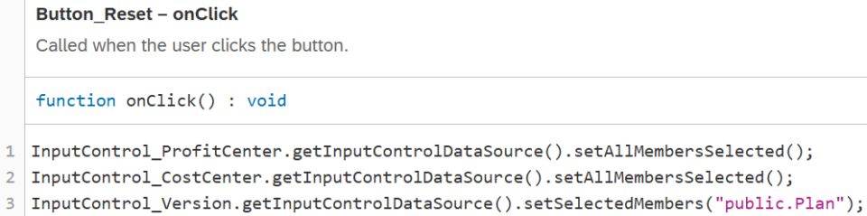
In our planning demo, we have used JavaScript both for simple usability enhancements and for more complex needs. One simple enhancement that can be achieved with JavaScript is the reset button. You can make input controls return to a pre-defined state by clicking on a button.
The code is very easy to write, and it only requires one line per input control.
For a more complex example, there is also an “add new job classification” button in the workforce planning input story. When this button is clicked, a pop-up appears prompting the user to enter the values that will define the new job classification: ID, display name, department, and whether it’s a full-time position. The design of the pop-up is fully customizable. When the user fills all prompts and clicks the “Add” button, custom JavaScript code is executed. It checks whether the prompts have been filled correctly and whether there already exists a job classification with this ID. If there are any issues, a custom error message appears, informing the user what needs to be changed. If everything is fine, the job classification is added to the dimension, the pop-up closes, and a success message appears at the bottom of the screen.

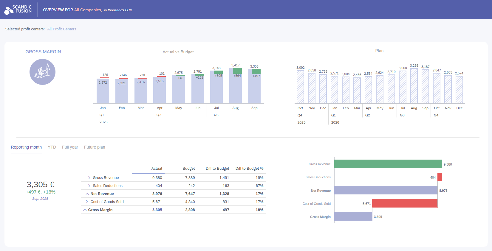
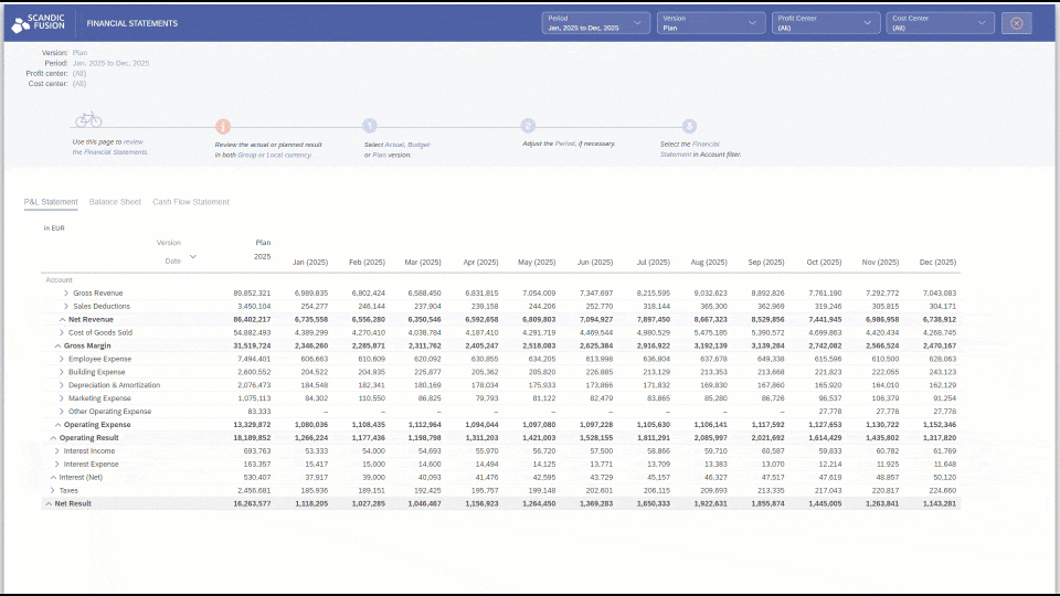
For all but the most basic planning needs, data input and data overview are organized in separate BI stories. The overview story is built with the best dashboard building practices in mind, and it can be used both to see an overview of the entire enterprise, or to drill into any part of the business.
Tab strips are very useful for switching between similar objects. In our planning demo, they are used to switch between different time granularities (reporting month, year-to-date, and full year), as well as to switch between local and group currency. This is an efficient way of organizing space in BI stories.
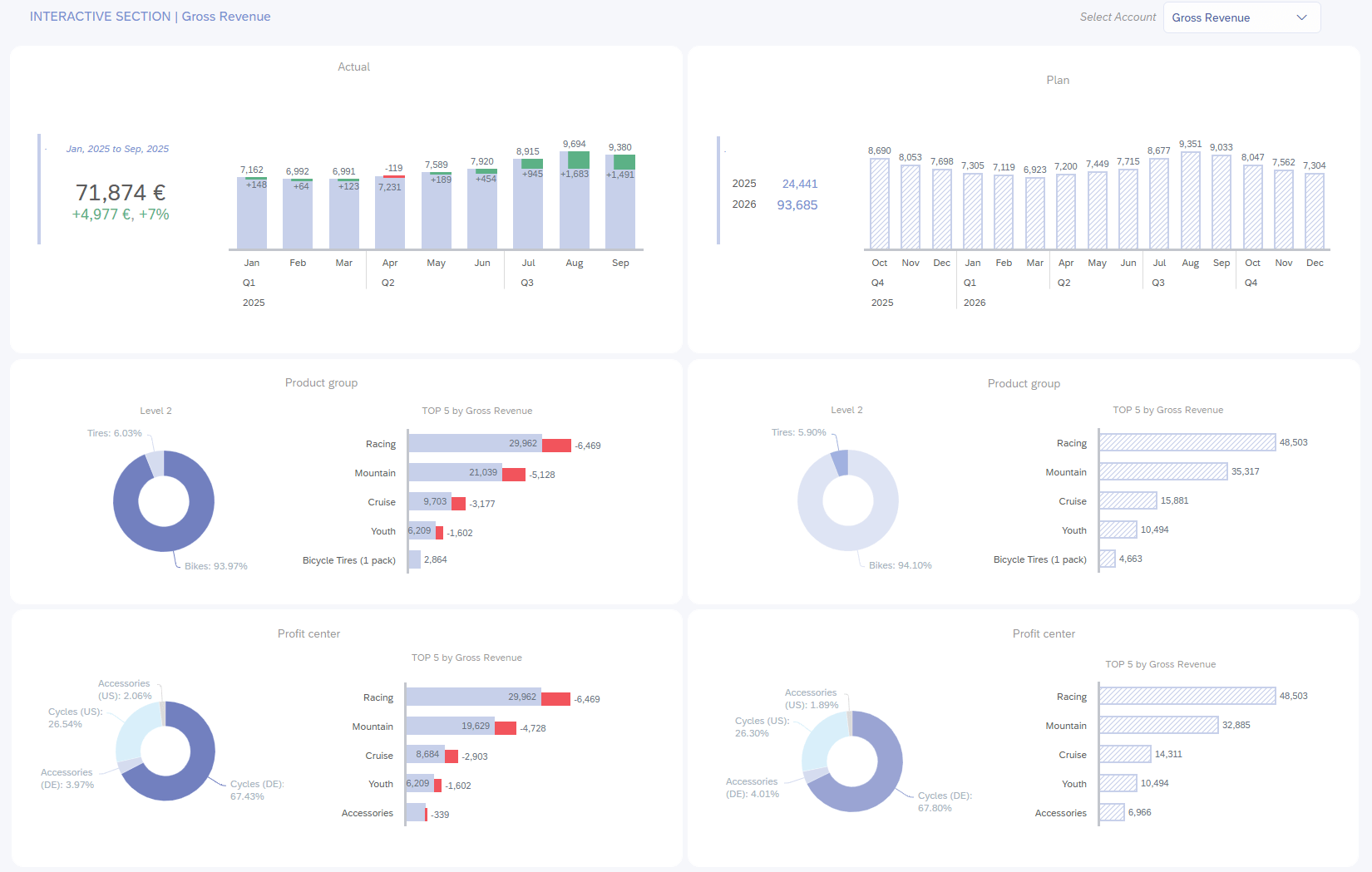
One of the features that we use to make stories more engaging and intuitive for business users is linked analysis. All overview stories in our planning demo have a section that is designed for interactive use. Users can click on any chart to filter the entire section. Additionally, they can drill into the charts to arrive at their desired level of detail.
OFFER-BANNER-HERE
In SAC planning models, there are three ways to do calculations on top of acquired data – model formulas, story calculations, and data actions. Each of these options has its advantages, and for best results we often use all three types of calculations.
Model formulas can be defined either within the account dimension or by creating a calculated measure. These calculations will be performed on the fly – whenever there is a change in the underlying values, the formula will be recalculated automatically. For instance, in a financial planning model, there might be an account calculating the gross margin percentage. This account would be calculated using a model formula, and its value would automatically be updated whenever there is a change in revenue or cost of goods sold.
Story calculations are also calculated on the fly, but there are more options than with model formulas. Using restricted measures, it is possible to define calculations that retrieve data from dimension members that would otherwise be filtered out of the table. These can be combined with calculated measures, which allow the use of custom formulas. The one drawback of story calculations is that they are attached to the story they are created in and cannot be copied to other stories.
Finally, data actions are used for the most advanced calculations. These are pre-defined algorithms that materialize values in the model. Data actions can be quite varied in their complexity. Use cases range from very simple (such as copying the last actual value to the plan version) to very complex (such as complex multi-step allocations). Data actions would also be used to copy values between models.
These calculations can be either scheduled to be performed automatically, or they can be executed by the end user. Data actions can be grouped together with import jobs and predictive scenarios to create multi actions, and these can be scheduled together. It is possible to define parameters that the user can select before executing the data action, for instance, to perform the action only on selected cost centers.
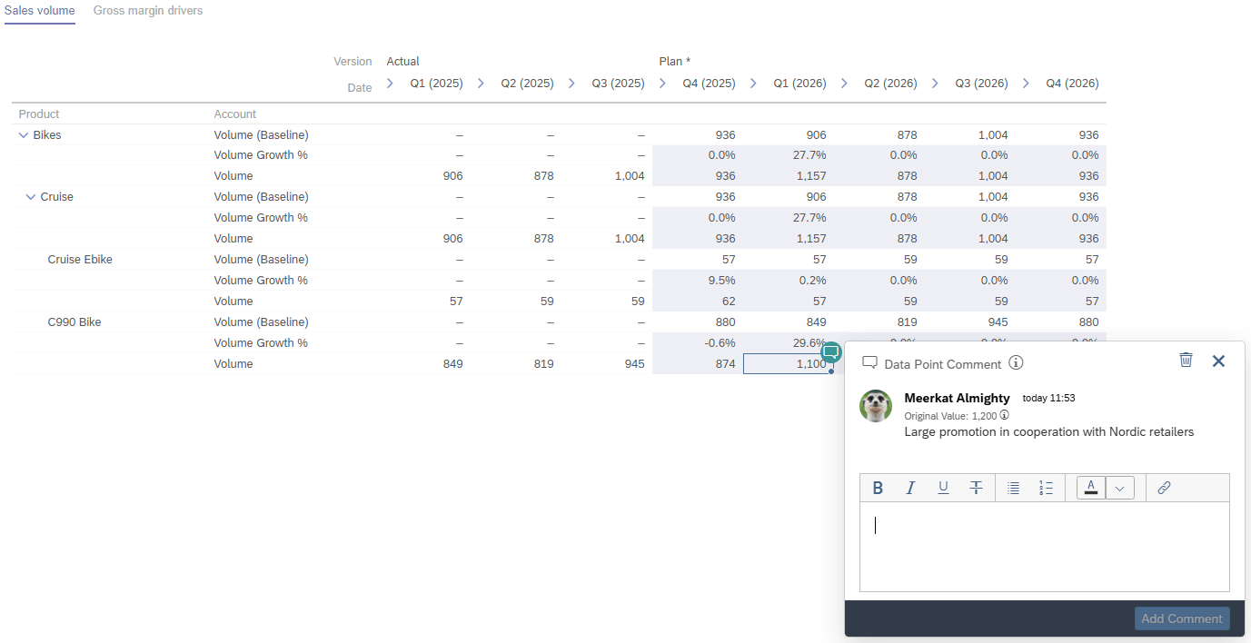
Data point comments are a very useful tool for communication between users. When they are enabled, users can add comments on individual data points, which will be saved within the exact context that the table is displaying. This means that the comment is saved at model level and can be accessed from any table in any story that is set up to show the same data point.
If a cell has a data point comment, its top right corner is colored green, giving the user a visual indication. When you click on the corner of the cell, the comment is shown, along with its author, the time it was made, and the value of the cell at the time the comment was made. The last feature in particular can be quite useful, because it helps the user understand whether the comment is still relevant.
Finally, data point comments have additional collaborative features that simplify communication between users. A user can like another user’s comment, and they can also respond to that comment, and start a discussion within the data point comment.
There is a common need for limiting data access to some users. In SAP Analytics Cloud, it’s possible to set up data access control for every dimension in the model. For each item of that dimension, it’s possible to set up read and write rights separately. In other words, when data access control is enabled for a dimension (e.g., product line), the user, depending on their level of clearance for each particular product line, can have the right to enter plan values, only see plan values, or not see anything.
Beyond that, data locking can be set up via the model. This is useful when the plan needs to be locked for editing after a certain date. For instance, if there is a deadline for submitting next year’s budget, next year’s plan can be locked for editing once that deadline is reached. Locking can be done in any granularity – so, if different business areas submit their budgets at different times, the earlier ones can be locked while leaving other business areas open for planning.
SAP Analytics Cloud is a very useful and adaptable tool that supports quite complex and specific planning needs. It provides collaboration features, cross-model integration, and best of all – the BI content that you can build on top of the planning input and overview pages is unmatched.
If you want to see how to get started with SAP Analytics Cloud for planning, check out our case study with the University of Helsinki. Their journey began with a focused Proof of Concept that validated SAC Planning as the right solution and set the stage for a complete modernization of their financial planning system.
If you’re interested in seeing our own planning demo, feel free to reach out to us. Let’s discuss your planning needs and arrange a time to see SAP Analytics Cloud in action.
Industry:
Tech Stack:
Operating in:


.png)